myspace'esque

Onyx

TPF Noob!
Joined
Aug 16, 2005
Messages
121
Reaction score
1
Location
Washington
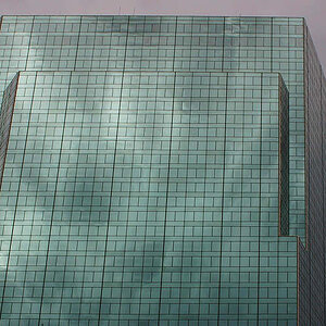
So I hadn't ever taken the typical myspace mirror pic, so I decided I'd give it a try.
mirrorfinished.jpg

i like it but im not sure if its too yellow or whether or not the composition is good. lemme know what you think!

p.s. it was taken with my sony P&S.
 
wow I do like it! I like tha angleand the colours. Also framing and an idea is great! The only think that bother's me is a lamp. hmmm maybe you'll try setting an apperture on something like f8 or smaller (f16) to get some kind of "star effect"
 
nolamp.jpg


ok i decided to take the lamp out completely. is it better now? :blushing:
 
Yah I think it looks better without the lamps. Hehe, Ah myspace...them and their mirror pics *shakes head*
Very cute idea, very clever. I like the gold theme.
Actually now that I think about it, it seems a little barron without the lamps. I dunno. Maybe if something else were in the background. Eh, good pic either way.
 
All the elements are there. Some how the lamp adds to the photo.

I think it is a little wide. I would try and shoot from far away and zoom in. This may compress the image a little more. I like the yellow feel, but I would like to see a little stronger separation of tones. In Photoshop: convert to CMYK and adjust each channel separately in levels.
 
I have to admit i like the original with lamp better. Definitely better and great to see something different from all those lame myspace mirror pics.:thumbup:
 
I disagree, I like it much better without the lamp. (But maybe it's 'cause I just hate that style of lamp- my bf has one and he refuses to get rid of it haha)
 
The absence of the light really makes the photo have a very M.C. Escher feel. I'm sure why I like this pic, But I do. It just draws me in.

-Fiona
 

Most reactions

New Topics

Back
Top