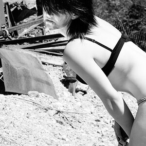
Earrings, belt, coin in the hand, the products, the details of the machine. But...you know, sometimes it's not an issue if there are too many elements in a picture. It depends on the kind of picture. If it was a street photography and it was candid, that wouldn't have been a problem. But it's pose, so...I don't know.. I would try a B/W to see if colors are less distracting and if her shape comes out in a stronger way.
Beside this I don't want to seem the know-it-all-scholar. Photography is overall a matter of personal taste and everyone has his/her own one. And I respect that.
Nice; I'm not as fond of #2 either. I'm not sure that it's too many elements bothering me as it is the contrast between the blank wall and the crazy-busy vending machine.
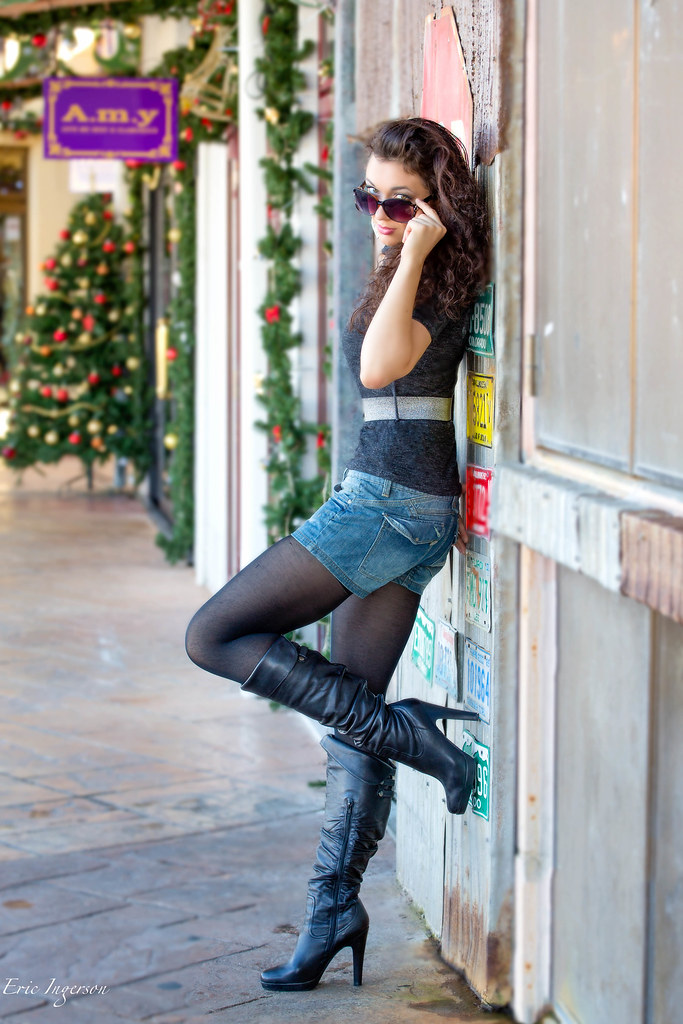
No. 1 had to be my favorite. That is as perfect as you are going to get that shot, I believe. Except, the Amy sign is a bit distracting? Maybe burn the color a little to bring it down. I'm really being nit picky with that, but my eye went there right after the beautiful model. Great shot!
Coming from a total layperson, on #1, my eye goes directly to the "AMY" sign, then back to the girl.
#2? I just don't know why, but I'm not fond of it. The colors of the vending machine make it appear almost washed out and very busy. I find myself concentrating on the machine, before the beautiful girl.
#3 would be my pick ofthe litter

 Kat
Kat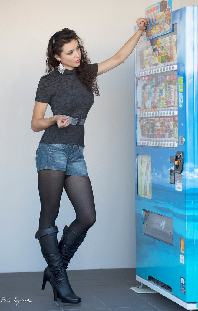 Kat 2-1
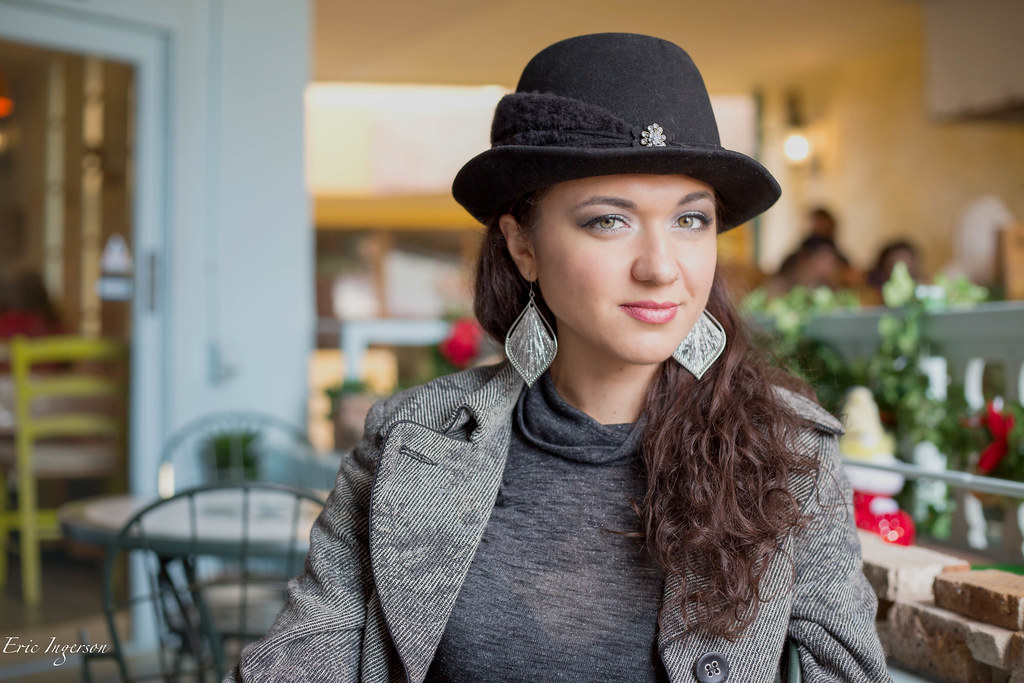 Kat 1-1
![[No title]](/data/xfmg/thumbnail/32/32929-22e23acc63d6ecb25e5ee941be87121f.jpg?1619735758)
![[No title]](/data/xfmg/thumbnail/37/37605-90c8efaef5b7d1f52d4bf8e7dfd33673.jpg?1619738148)