negative

thebeginning

TPF Noob!
Joined
Jan 10, 2005
Messages
3,795
Reaction score
30
Location
Texas
Website
www.danielcolvinphotography.com
Can others edit my Photos
Photos NOT OK to edit
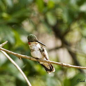
this was going to be a series...i might still try. thank you for looking.

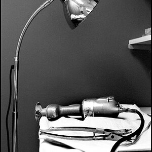
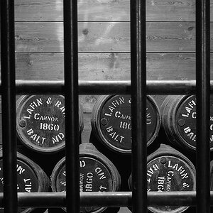
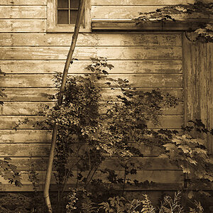
oh, and this is to be viewed as one image, not four.

negativegroup.jpg
 
I'm not sure I completely 'get' it. What's in the bottom left corner? And were you going to leave the series as negatives or print them?

I think I'd prefer them as seperate photos, not in a series, because I can't really see a link between them. Although maybe once I know what that bottom one is.
 
Might be more effective with just one negative, at a larger size. That way we can tell what it is.
 
hm ok.

i might try that. they werent really supposed to really coincide perfectly (the bottom left one is supposed to be of basically nothing).

here they are edited a bit and split up:

negative-clock.jpg


negative-spider.jpg


negative-leaf.jpg
 
i cant believe that nobody notices that they are dark...which is really strange, considering they are always lighter in photoshop and everything...it's only when i upload. hmm


edit...
okay everyone, i've decided i wasnt interested with these images really, so i changed them even more. i posted them under the photo gallery under the title 'homemade snapshots'. commenting is still welcome
 
This is an interesting concept... Not sure exactly what I think of it yet, but I'm definately interested. It's hard to criticize, though, becuase it's so unique. I will say that I opened the original in Gimp (the Linux equivalent of Photoshop) and played around with it myself, contrast, inverting the colors, luminance levels, and I think I narrowed down the feel of it, at least for myself.

I really don't know what to say. It's interesting, and it definately held my attention for more than a couple of minutes. I do prefer them together... sort of an enlargement of a contact print... or a negative of a contact print. Showing it as all four together, but a bit smaller so that it fits on the monitor, makes it a bit easier to grasp.

Aye, I think I like this one. Certainly thought-provoking and attention-holding, which are always good things.
 
PS... I like the grass... if that's what it is. In fact, the more I puzzle over this, the more I like it.

I'll go take a look at the gallery now.
 
Maybe it's my monitor, but they're really too dark for me. I can faintly see what's on them, but not enough to appreciate them.
 
^^ that was mostly intentional...i wanted the eye to have to search for the image a little bit. i inverted them (and i think you've already seen them) to make them into more 'normal' looking, and brighter photos, and posted them in general photo gallery.
 
Nice work! I like the spider best. I would group the four together. Go for a series, I think you're onto something here. You'll find that if you are doing this kind of work, people will say things like "how come it's so dark" and "why doesn't it look like a normal photo" and "what is it supposed to be of". Don't let that bother you. What is the title?
 

Most reactions

New Topics

Back
Top