New Branding and Abstract Photo

shmne

No longer a newbie, moving up!
Joined
Jun 3, 2009
Messages
641
Reaction score
83
Location
Florida
Can others edit my Photos
Photos OK to edit
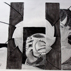
First I finished my branding finally. This is just the logo, but I have everything from contracts to envelopes to a style guide containing all of the rules of engagement for the brand.

newlogo04.jpg


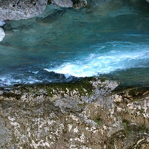
This is just a random abstract-ish shot. Pretty obvious what it is, but there wasn't an intentional subject. I just liked the blur and coloring.
abstractb.jpg


Makes for an interesting background.
 
I hope your armor fits you well sir, and that your mount is strong and steady beneath you as you enter the fray. The rules of engagement are constantly shifting, and a noble knight such as yourself must always be wary of knaves with cameras, lurking beside the king's roads, waiting to ambush men such as yourself with low prices and shoddy, apprentice-level works, which they try and pass off as if they had been be done by a journeyman, or nay, by a master. Keep your wits about you. Keep your sword sharp, and your lances well-repaired.
 
Derrel said:
I hope your armor fits you well sir, and that your mount is strong and steady beneath you as you enter the fray. The rules of engagement are constantly shifting, and a noble knight such as yourself must always be wary of knaves with cameras, lurking beside the king's roads, waiting to ambush men such as yourself with low prices and shoddy, apprentice-level works, which they try and pass off as if they had been be done by a journeyman, or nay, by a master. Keep your wits about you. Keep your sword sharp, and your lances well-repaired.

Classic...
 
I hope your armor fits you well sir, and that your mount is strong and steady beneath you as you enter the fray. The rules of engagement are constantly shifting, and a noble knight such as yourself must always be wary of knaves with cameras, lurking beside the king's roads, waiting to ambush men such as yourself with low prices and shoddy, apprentice-level works, which they try and pass off as if they had been be done by a journeyman, or nay, by a master. Keep your wits about you. Keep your sword sharp, and your lances well-repaired.

:hug:: that really was classic.
 
Last edited:
Since I'm friends with a few graphic designers and know they always have a story behind their work, whats yours? More or less a background on why you used the style of design, fleur de lis (sort of partial to this, being from New Orleans)? Trust me, not being rude, just really interested in how/why you did what you did :)

Overall, I like it a lot. Only nitpicky thing is the graphic on side of the "J", not sure I'm diggin the dark blue piece connected to the light blue piece. Just looks out of place.
 
Geaux likes it because it has the saints logo on it.. admit it!

Since I'm friends with a few graphic designers and know they always have a story behind their work, whats yours? More or less a background on why you used the style of design, fleur de lis (sort of partial to this, being from New Orleans)? Trust me, not being rude, just really interested in how/why you did what you did :)

Overall, I like it a lot. Only nitpicky thing is the graphic on side of the "J", not sure I'm diggin the dark blue piece connected to the light blue piece. Just looks out of place.

This is actually a take on my family crest, we come from Greece and the section where it switches color is due to the fabric twisting and exposing the underside which is colored differently (this is commonly done on crests like this, but I do understand what you mean. This problem didn't exist as before hand it was not the only flourish, I think I'll have to rework that section) The flur de lis is actually French in its origin (why you think of New Orleans) however it has been part of many European houses, and on the other side of my family there is an offshoot way down the line that is actually Spanish. Oddly enough this French symbol made its way to Spain, and I felt it was fitting to honor that part of the family (as normally we just say we're Greek) so I decided to include a symbol that appears commonly from Spain. Granted it may not be that common, but I still felt it was fitting. In addition to that, I also felt it was a nice tie to the European side in general.

The Flourishes to the left and right of the main crest are meant to be a stylized version of the olive leaf crown awarded to the winners of the Ancient Greek Olympics.

The shield shaping was chosen to match the text, sharp connections and curves. A more masculine style, as other shields tend to be more feminine (or just very soft curves.)

The colors come from multiple meanings. First the light blue was chosen because if you have ever heard of a color personality test I am a blue / green individual, so my primary color (blue) was chosen. The gray color is actually a very dark blue so this is a monochromatic color scheme. The dark cobalt gray was chosen because black is a very powerful color, and generally screams "status." I didn't want my logo to be overwhelmed so I decided to bring in more of a gray aspect, yet keeping that power status feeling.

Finally the Joe Coulas on the bottom is actually left over from the original design. That used to be my logo, with the J and C from the crest instead. It acts as a platform for me to insert a tag-line or any kind of call to action like my number / email.

Overall the concept isn't "Ye Olde' Knights" as Derrel put it. The concept behind the logo aside from family heritage is "Lasting through the ages." Which is achieved from the various styling chosen through the ages.

I appreciate the interest :)
 
Sorry Joe,

IMO your logo is not effective. To me, your name should be the major element, not the graphics
 
Edit**Fixing size, didn't realize how huge it was...

Fair enough, you would probably prefer my original over the new incarnation then:
flourishlogo10.png


I know this current version is a bit riskier, and I still use the above logo as my main one for the moment. Actually for the very reason you stated, I can't place it on many things (like a letter head) so I'm not 100% sure yet if I am going to go through with the branding. I still have all my old material for the moment (which is actually essentially the same.)

I may just end up using this as a landing page. Sometimes I really like to focus on graphics when I shouldn't, partly because of my background :x.
 
I don't know what his problem is with this image, but I like it for the reasons you've already pointed out - just the right amount of blur and the colors work very well together. I don't know if you've looked at some of the sites of the people that would offer critique on graphic design... but if you had, you may not be too offended when you realize they don't really have a clue when it comes to that particular form of art.
 
I hope your armor fits you well sir, and that your mount is strong and steady beneath you as you enter the fray. The rules of engagement are constantly shifting, and a noble knight such as yourself must always be wary of knaves with cameras, lurking beside the king's roads, waiting to ambush men such as yourself with low prices and shoddy, apprentice-level works, which they try and pass off as if they had been be done by a journeyman, or nay, by a master. Keep your wits about you. Keep your sword sharp, and your lances well-repaired.

Why always so grumpy :hug::do you need a hug? I'm just curious how my work is shoddy, and my prices are low o.o

It's not like I'm a professional photographer anyway, Head of Inbound Marketing and freelance graphic designer for over 2 years now...


I don't think he was talking about your photographics being shoddy, I think that's the lurking camera knaves' work he's talking about. Haha, classic little take on what happens so commonly in photography nowadays...

I like! Interesting taking the old family crest and turning it into a new, modern form. Must resist urge to steal idea and implement on my own family crest...!

I actually just realized that as you said that >_> So if thats the case sorry Derrel! And if that isn't the case... yarrrrrrgh!

Also thanks for the comments, I always appreciate it. If you steal the idea it will still be unique to you :) Sure I came up with the concept, but I can't tell you how many times my cohorts and I "steal" each others concepts. They always come out completely different though, that is the fun of art!

I must say though KmH hit the nail on the head, it is a bit too graphically focused. So if you were to take the concept try to stay away from focusing so much on the crest. I will most likely only be using it as a cover page, or other parts as graphical artwork that blends into my branding.

About the photo-
I really love the coloring a lot in this, and the overall image just looks so creamy! I chose it because the style somewhat matches my new logo, and felt that it was a nice share.
 
This is actually a take on my family crest, we come from Greece and the section where it switches color is due to the fabric twisting and exposing the underside which is colored differently (this is commonly done on crests like this, but I do understand what you mean. This problem didn't exist as before hand it was not the only flourish, I think I'll have to rework that section) The flur de lis is actually French in its origin (why you think of New Orleans) however it has been part of many European houses, and on the other side of my family there is an offshoot way down the line that is actually Spanish. Oddly enough this French symbol made its way to Spain, and I felt it was fitting to honor that part of the family (as normally we just say we're Greek) so I decided to include a symbol that appears commonly from Spain. Granted it may not be that common, but I still felt it was fitting. In addition to that, I also felt it was a nice tie to the European side in general.

The Flourishes to the left and right of the main crest are meant to be a stylized version of the olive leaf crown awarded to the winners of the Ancient Greek Olympics.

The shield shaping was chosen to match the text, sharp connections and curves. A more masculine style, as other shields tend to be more feminine (or just very soft curves.)

The colors come from multiple meanings. First the light blue was chosen because if you have ever heard of a color personality test I am a blue / green individual, so my primary color (blue) was chosen. The gray color is actually a very dark blue so this is a monochromatic color scheme. The dark cobalt gray was chosen because black is a very powerful color, and generally screams "status." I didn't want my logo to be overwhelmed so I decided to bring in more of a gray aspect, yet keeping that power status feeling.

Finally the Joe Coulas on the bottom is actually left over from the original design. That used to be my logo, with the J and C from the crest instead. It acts as a platform for me to insert a tag-line or any kind of call to action like my number / email.

Overall the concept isn't "Ye Olde' Knights" as Derrel put it. The concept behind the logo aside from family heritage is "Lasting through the ages." Which is achieved from the various styling chosen through the ages.

I appreciate the interest :)

I knew it! You guys always have such backgrounds behind your designs. Love it :)


Geaux likes it because it has the saints logo on it.. admit it!

lol, it's a huge symbol of the city I was born and raised in. Remember, the fleur de lis was in New Orleans far before the Saints were.
 
As an artist who once did quite a bit of graphic design including a lot of branding, I don't like either versions of your logo and I'm surprised that, as a graphic designer yourself, you came up with those...

In the first one, your name is almost not even there. It's the last thing I look at and probably the last thing I would remember. The first thing I would remember is how pretentious the design looks like. Ok, maybe some of it is tainted by the fact that I know France pretty well and the fleur-de-lis design here is actually a sign of the monarchy which, by the way, is why it shows up in some parts of the US. Those were areas that were named or settled by some frenchies in the name of their king of the day.

Now I know some americans would love to have a king or queen because it is so cool or, at the very least, they would love to have some blue-bloods to call their own but I just don't see using this symbol as the main part of my branding.

#2 is much better yet still way too much. Look at the big names out there (Coke, MacD, Ford, Nike, etc, etc) Their logos are the simplest ones. Don't let your personal feelings get in the way of the design. Actually, as a designer, you should know better than design your own logo. You should also know that the fewer things in that logo can be referenced to anything else, the better. Did I lose you here? Well, if I did, let me give you a very clear example: the fleur-de-lis is a symbol of slavery in one of the countries where I come from. It was used for branding slaves...

Now, my island is very small and there are probably very few people from there in the US but, 1/ you don't know that the next big company you get in touch with for work doesn't have a CEO who is from there, or 2/ that it wasn't used in the same way in some other place that the french colonized at some point... Was it used in that way in the US at some point? Do you get what I'm saying?

All that to say that keeping it simple has two obvious benefits: ease of remembering and no offending of anyone.

Sorry.

One last thought: have you looked at how your black and blue design translate into b&w? You may still have to deal with using your logo in monochrome, have you tried it?
 
I hope your armor fits you well sir, and that your mount is strong and steady beneath you as you enter the fray. The rules of engagement are constantly shifting, and a noble knight such as yourself must always be wary of knaves with cameras, lurking beside the king's roads, waiting to ambush men such as yourself with low prices and shoddy, apprentice-level works, which they try and pass off as if they had been be done by a journeyman, or nay, by a master. Keep your wits about you. Keep your sword sharp, and your lances well-repaired.

Why always so grumpy :hug::do you need a hug? I'm just curious how my work is shoddy, and my prices are low o.o

It's not like I'm a professional photographer anyway, Head of Inbound Marketing and freelance graphic designer for over 2 years now...

You have grossly misinterpreted what was written, and you have it all entirely ass-backwards. I was wishing YOU well, and telling YOU to watch out for OTHERS who offer shoddy work. Maybe bring in a friend, or an outside consultant to explain it to you...or try and break it down piece by piece...and take the FIRST part SERIOUSLY, and proceed to read my well-wishes through from there, mmmkay???

What I wrote was an actual wish for you, a toast if you will, but apparently it went right over your head...but four other TPF members "got it" and "liked it"...
 

Most reactions

Back
Top