New guy, Portrait shoot

bazcraig

TPF Noob!
Joined
Apr 25, 2007
Messages
4
Reaction score
0
Can others edit my Photos
Photos NOT OK to edit
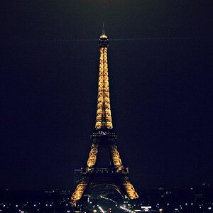
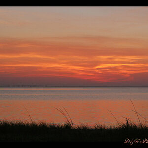
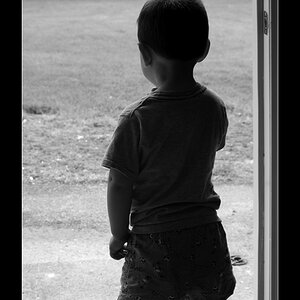
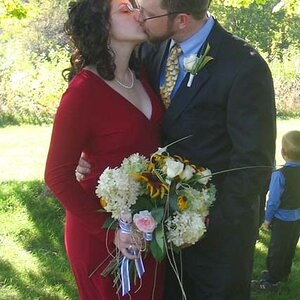
Hi, thought i might as well make my hello post relevant so here are some pictures from my last shoot. I'm mostly into portrait photography at the moment so ill probably be spending most of my time in this bit of the forum. Ive looked through some of the work and I'm very impressed with the levels being exhibited. Anyway, all comments and criticisms welcomed.
Hope to get to know you all!

-Barry

jonm2.jpg


cf005579tif05579ex3.jpg


cf005586tif05586ok0.jpg
 
Hey Barry. Really nice work here. Focusing on 2 & 3, I just have a few observations, which are just my opinion. The one thing that jumps out is that whites of the eyes are dodged a bit too much. It gives a strange fake look to me. I also kinda feel the cropping on the last two either needs to show more, or less. I kinda feels like it's in the netherworld between. As for the lighting styles, it appears you've side lit with a hairlight? (I could be wrong) I would personally like to see a bit more light on the front of the face. It seems a little dull and lifeless. Whenever I do side lighting like this, I like to have at least one of the lights pulled a little forward, not quite 45 degrees. What are these going to be used for if you don't mind me asking?
 
Thanks for your comments Matt,

Its lit with two 45 degree rear soft boxes and a tiny pop from a top over headlight. no front lights just a reflector.
Shot with a Phase One P20 digital medium format back on a Mamiya body.

they are just personal work, experimenting with different lighting etc. Hence no front lights.
 
Cool setup Barry. Is #1 a scan of a polaroid, or did you do that in post process? I got cought up with 2 and 3 and didn't comment on it. It's got a great low key look.
 
Yeah its a scan, got a few more that im still working my way through. Shot with a nice old RB.
 
I like the orange background. It brings things together because it is (somewhat) the same color of her skin and hair color in the first one. You can see the reflector in her eyes, but it looks more like a fillcard, but a fill card would not have given the same results, unless it was really close to her. You can tell a hair light was used too, because otherwise the softboxes would have just evenly lit them and it would look flat. It needs a more specular light to give it that shine.

I like the gradient in the back though, was that from the softboxes, or did you have another light on the seamless?

I like the first digital portrait the most because of the angle her face is at. We're not looking up her nose.
 
The post in number 2 is fantastic. She just devours the viewer with here eyes. I really could loose myself in that photo for hours. On the flip side I find number 3 very ordinary (but ordinary to the extent that it's just another great portrait, but nothing unique or exceptional).
 
Hello, Barry... and welcome.

I do like the fist two. The white shirt in the second works nicely with the intensity of the background. No so much on the third. And with the unconventional lighting scheme, bringing her chin up that much... well, besides shooting up the nose, it creates some troubling shadows on the forehead. And... the reflector falls off, leaving nothing in the eyes.

But those first two.... very nice.

Pete
 
Cheers for all the feedback, its really nice to have constructive relevant replies so quickly.

The gradient was just thanks to the soft boxes, tilting them slightly more towards the ground than i would normally have them.

ill post a couple more for the sake of it.

472589433_722f3fb7fe_o.jpg


473031440_baa6965080_o.jpg
 
I like the eye contact. It makes you focus more on her face. In the upper one where she's looking down, i'm looking more down at her body instead because she's looking down.
 

Most reactions

New Topics

Back
Top