New Here, Some of My Photos

Dleberfinger

TPF Noob!
Joined
Sep 18, 2009
Messages
16
Reaction score
0
Location
United States, PA
Can others edit my Photos
Photos NOT OK to edit
I'm new here, got tired of a different site that didn't really help me at all, a lot of "Nice photo!"'s and other random comments.. I'd like to get a little better but I can never tell what I'm different that makes a lot of other photos so much better then mine.

Give me some helpful C&C, thanks.

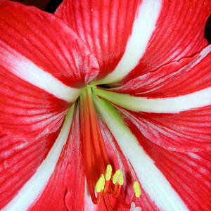
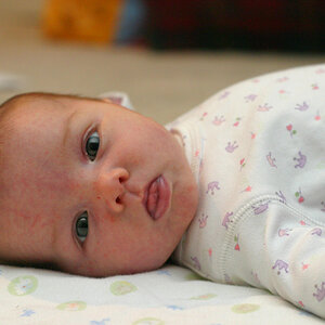
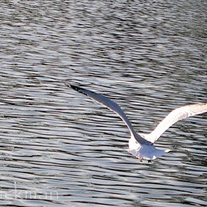
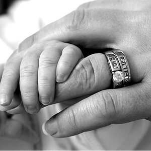
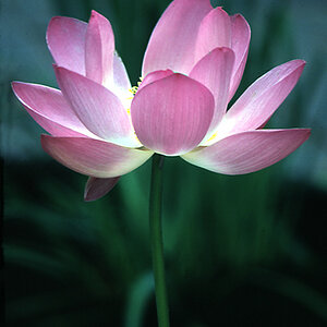
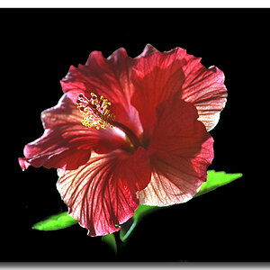
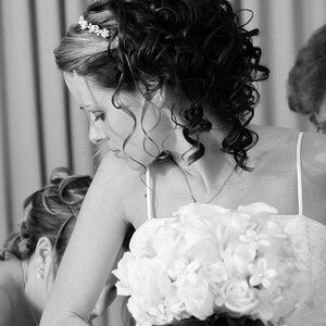
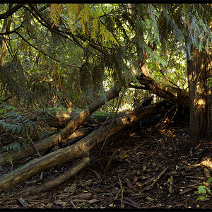
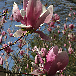
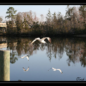
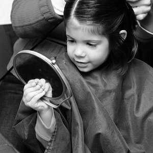
Just some of my more recent shots with my SLR and DSLR and using a few different lenses and even a macro adapter I made myself.

3923560229_13b6372aba_o.jpg


3875702267_9878ebe4e7_o.jpg


3845097235_83c9b38068_o.jpg


3797034376_183ae2d905_o.jpg


3743113227_5f18d3f534_o.jpg


3735869731_09183dd778_o.jpg


3726984823_55498fcd44_o.jpg


3701268619_70a893d313_o.jpg
 
The dogs rump looks intentionally blurred, so you do this to match the bokeh effect ?? I don't like it. I like your 2nd flower image but the fg flower is cropped and that's no good.
 
i would have to disagee, i love the one with dog, in fact its my favorite. The man with the bottle need alot more contrast, the gray is very dull, but its a great composition. The first flower is stunning, but is lacking color, i do love the bokeh in the background. :sexywink:

Oh and welcome! I just became a member of TPF today
 
Picture 1 will be better if you focus more on the sunflower instead of leaving the first half of the picture with background.

My favourite - Picture 3 & 6. Great composition
 
Welcome to TPF. Try to limit the number of photos you post for C&C to three, most people won't give detailed C&C on more than that. Also try to number your images. ;)

1. This looks soft to me and its underexposed. Since its not too underexposed it could be fixed\tweaked in photoshop.

2. This also seems to be out of focus. When taking photos of animals try to foucs on the eyes. Your background in this is also quite busy and distracting.

3. Nice composition, but I find the white glare of the sun distracting, if it had more color as opposed to being completely blown out, it would have made a nicer image.

4. Not interesting -to me anyway.

5. This is way to dark and I'm not sure if your main subject is supposed to be the man on the step or the bottle...

6. Nice composition on this one, but the focus looks soft and its underexposed. Some fill flash could have helped this one.

7. Your horizon line is tippd to the left.

8. I find this to be rather interesting, though something just isn't quite working in it, but I can't put my finger on what......
 
I like the foot prints in the sand but do agree with the above comment to keep the horizon level. I like your style though.
 
Thanks for the comments, especially you Dag.

For the one with the dog, I tried to focus mainly on his face, I was using a 50mm 1.7/f manual focus lens on my film SLR and he wouldn't stay still so it was a bit difficult.

I hadn't even noticed the horizon being off in the foot print picture, just never even looked above the waves.

The fourth picture was mainly just me testing out my macro adapter, that's a picture of 12 pt font.

The lily was a bit odd, I tried using a flash but it was too harsh and that was before I realized I could change the output of my flash. I have been trying to learn to use a flash but it's just not my thing..

The last one became a bit pixelated on the branches for some reason. I printed it out to 8x10 and it looks a lot better then on here, you can see all of the birds on the tree tops as well.

And the first one, again, like the dog picture, was hard to get, it was really windy out and I was using my 50mm 1.7/f MF lens. I was using my DSLR that time and took a bunch but it just didn't come out right any time and I gave up and kept the best. I had meant to get out and take it again but it was all wilted the next day. :(
 
I am like a lot of people here, I really enjoy the dog picture!! But the first photo is lacking colour, the silhouette photo I find there is not enough interest (you have to make the content either more simple, without the car, or complex), the tree picture has nice contrast but needs foreground interest.

Hopefully this helps, I hope when I post you help me out too!!!
 
I like the dog pic, but I would have put the empty space to the left of the dogs head, not to the right. It looks off balance. The blur on the butt seems odd too. But the lighting, color and especially the dogs expression are good.

Oh yeah, and watch those horizons. If they're just a little off it doesn't look intentional and kind of ruins the picture. Either straighten it out or take it way out of whack so it looks purposeful.

Welcome to the forum.
 
I am just going to go over the ones that stand out the most to me.

#3 - A little more unique then some dog pictures, which is good. The picture seems to be slanted. Focus seems slightly fuzzy, but not enough where I am annoyed by it. I would also crop closer and get the purple flowers out.

#7 - I like this shot, not sure what I like about it - but I like it. I am sure the horizon was tipped on purpose.

#8 - Love the different values of darkness and light here. Also a lot of texture, it was the picture of the series that really caught my eye. Very nit-picky, but I don't really like the pattern interupt in the very bottom right corner (the leaves).
 

Most reactions

Back
Top