TheBenzMan10
TPF Noob!
- Joined
- May 29, 2010
- Messages
- 7
- Reaction score
- 0
- Location
- NorthEast
- Can others edit my Photos
- Photos OK to edit
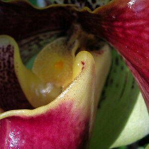
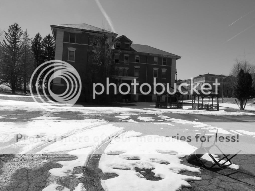
1.
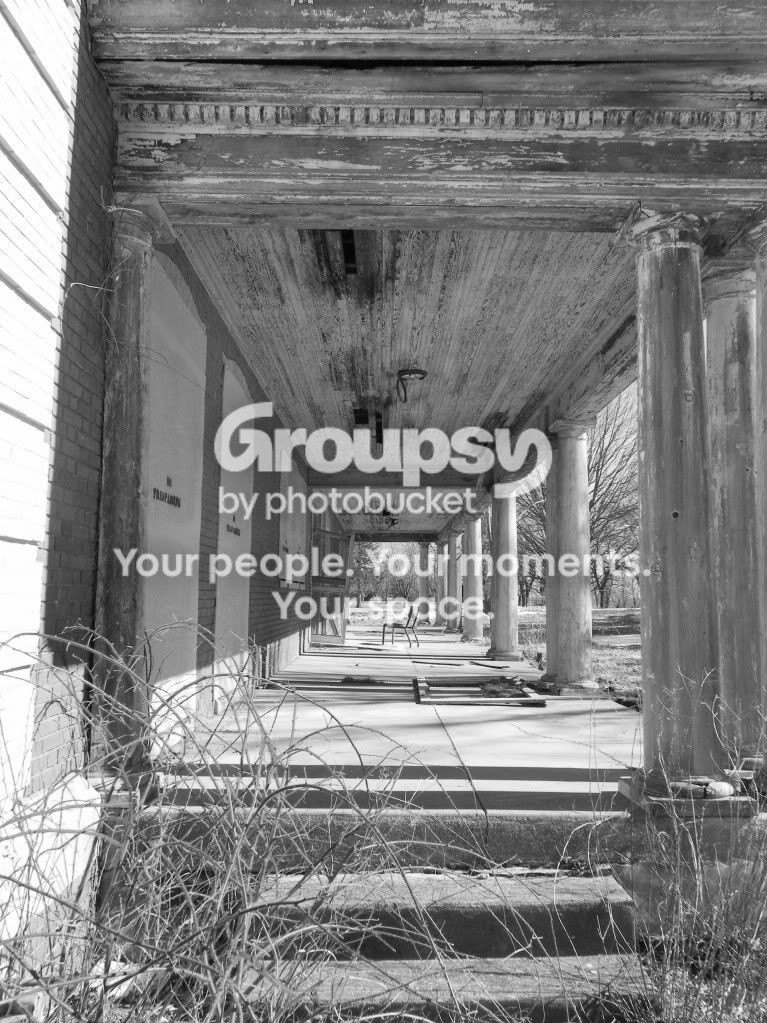
2.
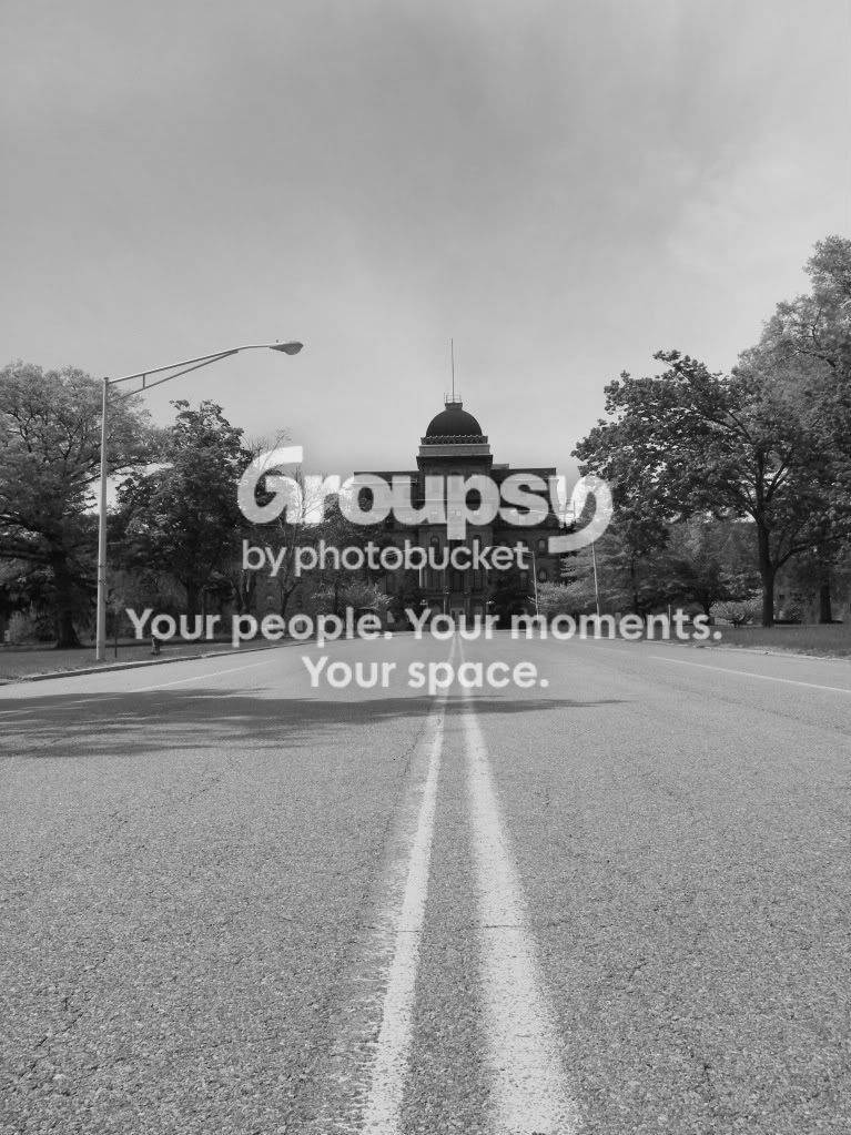
3.

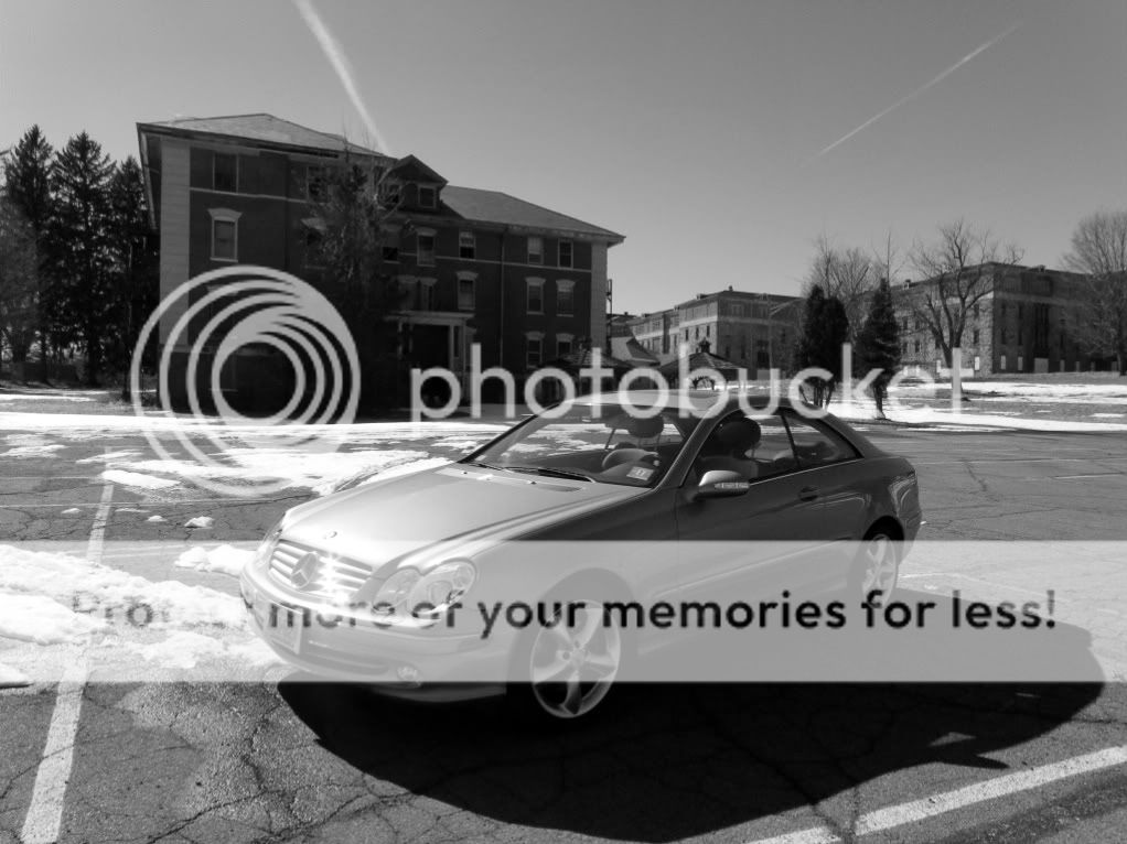
4.

5.
6.
7.
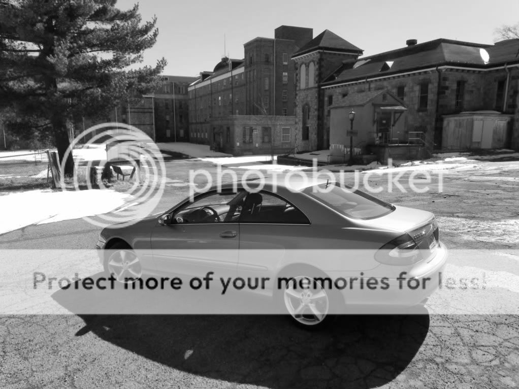
comments, suggestions, anything would be helpful
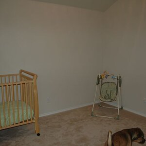
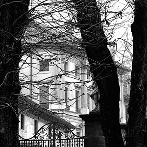
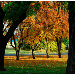
2.
3.
4.
5.
6.
7.
comments, suggestions, anything would be helpful


![[No title]](/data/xfmg/thumbnail/39/39442-c7791194bfea1b4d6bd382b004fb8488.jpg?1619739033)
![[No title]](/data/xfmg/thumbnail/39/39438-1eb8b5f82b59d9d0c72ae9025778ed4c.jpg?1619739032)