ncstater1919
TPF Noob!
- Joined
- Jul 12, 2008
- Messages
- 53
- Reaction score
- 0
- Location
- NC
- Can others edit my Photos
- Photos OK to edit
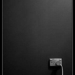
1

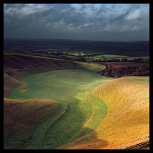
2
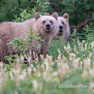
3

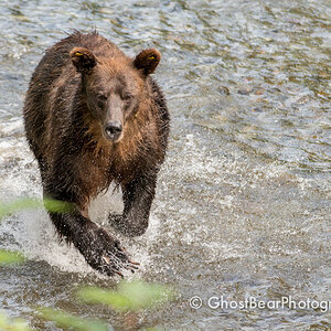
4

5

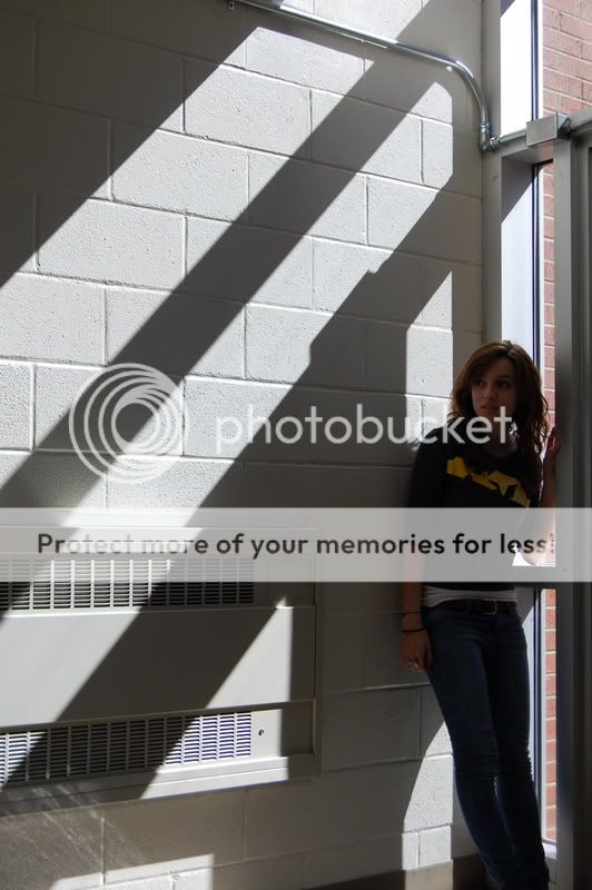
Any comments are welcome,
Thanks - Spencer
2
3
4
5
Any comments are welcome,
Thanks - Spencer
")