I really like 3. It makes me laugh, in a good way!
The first 2 are blown out, as with the 5th.
The 6th is too dark, and I don't find it very interesting. I think what is missing is a reflection in the puppies' eyes. Right now, it just seems too lifeless.
4 is too blue, and I think a tighter crop would be better.
I like the last one, but I believe it is too yellow.
Hope that some of this was useful...! Oh. could you possile number the images? It would make criticing much easier
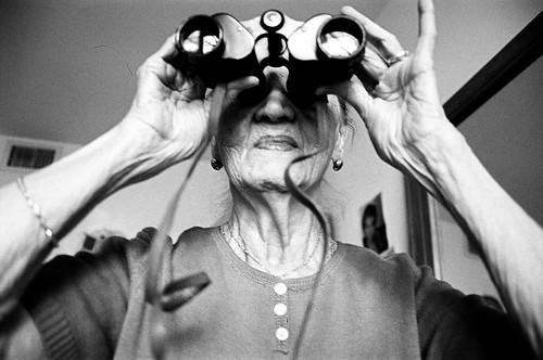
Love the last one...self portrait?
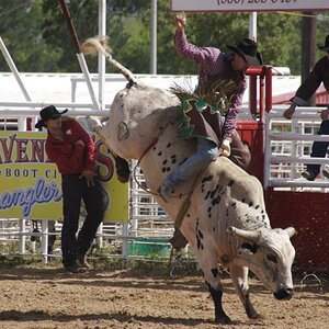
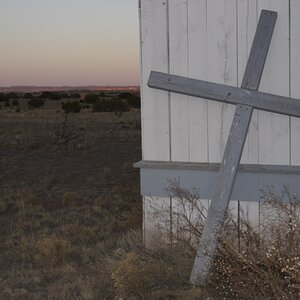
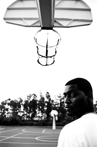
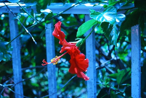
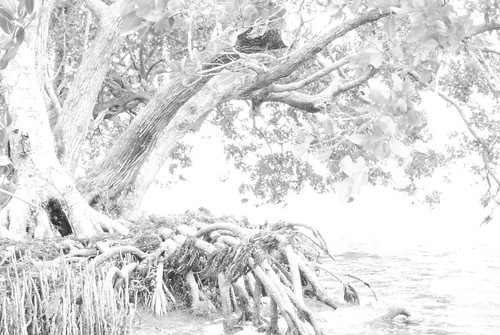
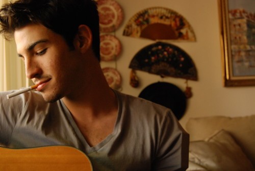
The red flower and blue background scream so loud I could hardly look at that one. Basketball guy is pretty neat...a little fuzzy to me. Lady with binocs is pretty cool...dog is good, but the carpet in the foreground being out of focus distracts from the doggie...and ..ummm...that tree one...is that a photograph of a drawing? not that you can't do that or anything....just askin.
overall, from one newb to another, I'd say you're better than some, but those shots could be better....
but i really do like the last one...very Little Miss Sunshine meets The Mexican.
thanks so much guys i appreciate it. That's not a self-portrait its a friend of mine who is using it for his (acting) portfolio. Actually, that photo of the tree is completely over exposed, no special effects, as a matter of fact i like to stay away from photoshop so i can discipline myself on how to actually take 'perfect' pictures without software..THANKS ALOT THOUGH! and i will number them.
I really like 3. It makes me laugh, in a good way!
The first 2 are blown out, as with the 5th.
The 6th is too dark, and I don't find it very interesting. I think what is missing is a reflection in the puppies' eyes. Right now, it just seems too lifeless.
4 is too blue, and I think a tighter crop would be better.
I like the last one, but I believe it is too yellow.
Hope that some of this was useful...! Oh. could you possile number the images? It would make criticing much easier
You need to experiment more with your exposures, but otherwise you have great composition. You look to have some camera tilt on the first 2 shots too. Make sure those backgrounds are aligned before you snap the shutter and you'll be pulling out some great images.


![[No title]](/data/xfmg/thumbnail/35/35868-15d995e4052bf05e2038e8b2a545a08f.jpg?1619737195)
![[No title]](/data/xfmg/thumbnail/35/35265-c9ea3efd2c618a57ea136e63ad106880.jpg?1619736970)
![[No title]](/data/xfmg/thumbnail/42/42023-bdd979ff50e78cc28479297780caeb90.jpg?1619739981)

![[No title]](/data/xfmg/thumbnail/35/35268-34a315519597f60516d59124092e9bc2.jpg?1619736971)