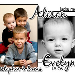
I love 3 and 5 he/she is so cute! congrats first off.
the cap on the first one doesn't really fit it, its a distraction. number could of been a bit zoomed in. but i like the lighting on all of them, its soft. I definitely frame the 5th and 3rd one its really nice.
the color ones feel over exposed. It's almost like the baby or it's clothing is blending into the background.
the black and white one, the baby's head and the adult hands are too dark. the point of focus is the torso which feels wrong
on the first photo I would have changed the point of view to be more onto the face and less onto the torso. you lose the emotional connection with the baby staring off into space.


 he/she is so cute! congrats first off.


![[No title]](/data/xfmg/thumbnail/37/37602-1ef8dbb1c2d0e4ff347ee65d328c3603.jpg?1619738147)