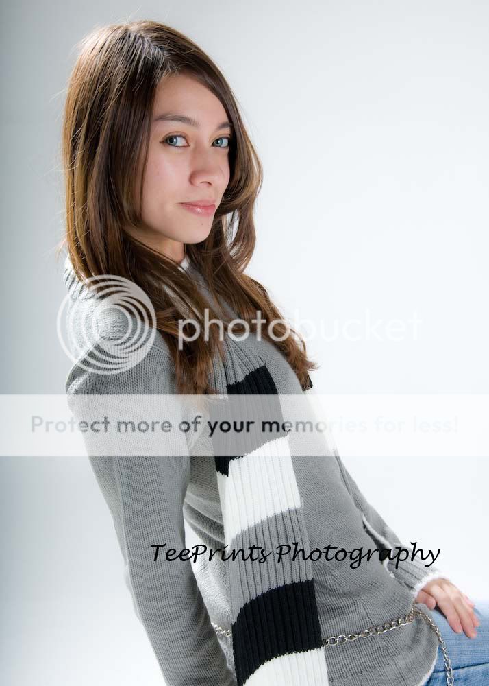
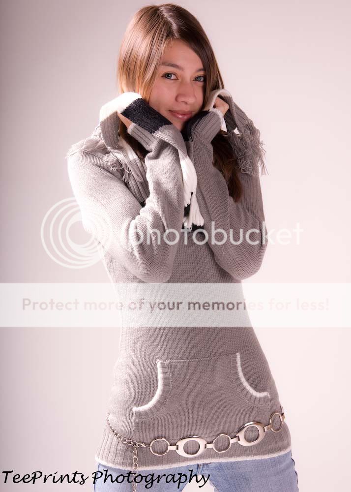
Two, in my opinion, is your best shot. On one, I don't like the cut-off hands, three has a bad color cast, but it and one have nice lighting. On the last two, your light is too harsh for a young girl. Soften it up a bit and it'll improve them greatly, Also look a bit under exposed as well.
I dunno, I actually like the last two (particularly #4) and the look it gives. You are right it does make her look older. The only other problem with the lighting on #4 and #5 (if this is a problem) is that they are much different than the lighting on the first three. It is a way different feel which some may not like.
I think #5 looks a little funny, I think that from this angle it would be better if you could only see one of her eyes. You could do this by having her face a bit more away from you, and not look directly at the camera.
I think one looks a bit like a monkey because of the lack of hands. You have no idea if the arms keep going and going.
My favorite is probably #3, I like the pose, it just looks really cute. A main problem is that the hands are covering up a bit of the face, but... it's still my favorite


![[No title]](/data/xfmg/thumbnail/37/37602-1ef8dbb1c2d0e4ff347ee65d328c3603.jpg?1619738147)