ferguson911
TPF Noob!
- Joined
- Apr 10, 2010
- Messages
- 102
- Reaction score
- 0
- Location
- Quebec, Canada
- Can others edit my Photos
- Photos OK to edit
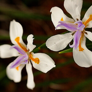
1. Unperfect white flower

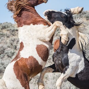
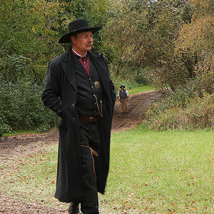
2. Rebel rock

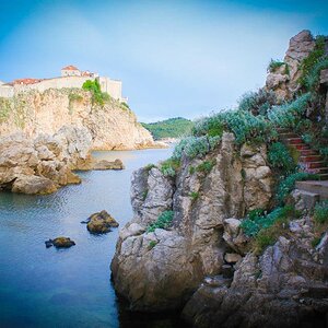
3. The crow

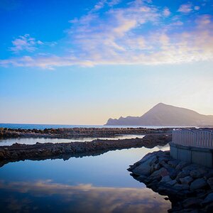
4. Brooks n' trees

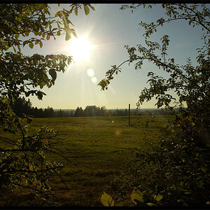
5. No so beautiful nature

I would love to have your constructive criticism on every photo I have posted, alot of time was put into shooting them and Post-production on them
The portrait was done with a standard mirror umbrella, a softbox as a fill light and another soft box as background light.
thank you in advance!
2. Rebel rock
3. The crow
4. Brooks n' trees
5. No so beautiful nature
I would love to have your constructive criticism on every photo I have posted, alot of time was put into shooting them and Post-production on them
The portrait was done with a standard mirror umbrella, a softbox as a fill light and another soft box as background light.
thank you in advance!

![[No title]](/data/xfmg/thumbnail/37/37110-1d5d98524f9f6a8623703161610ef439.jpg?1619737882)
![[No title]](/data/xfmg/thumbnail/31/31751-fb2f68cca32f9eec468dbde7d649840f.jpg?1619734990)
![[No title]](/data/xfmg/thumbnail/37/37109-62e1b65e6f8bd2a349250acd6d653f1e.jpg?1619737882)
![[No title]](/data/xfmg/thumbnail/38/38293-15e3a85f038b239e3c60bf9f38f5d56c.jpg?1619738563)