Nitpick, please!

sarahp

TPF Noob!
Joined
Jan 20, 2009
Messages
30
Reaction score
1
Location
Michigan
Website
www.sarahpetriephotography.com
Can others edit my Photos
Photos OK to edit
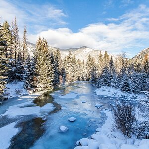
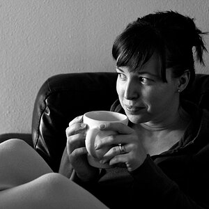
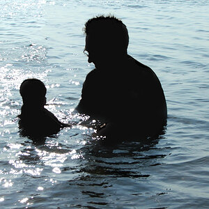
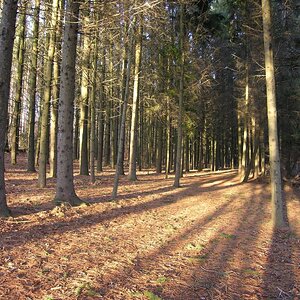
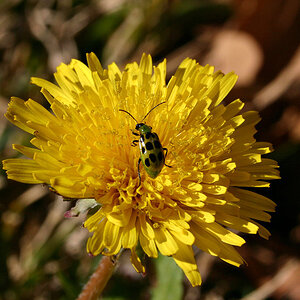
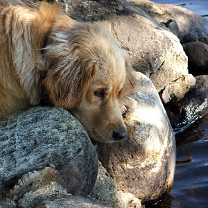
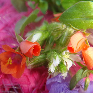
I've just put up my website and would LOVE some honest feedback on EVERYTHING - from the colors and layout to the actual photographs in the galleries. Major undertaking, I know. I'm particularly interested in opinions about the photographs themselves...composition, PPing, and especially any color casts/skin tone issues there may be.

Here's the link:
Sarah Petrie Photography

Honest CC is appreciated. Thanks!!!
 
I think its a great site.

Pros:
1. Easy to navigate
2. Not too overboard on colors
3. Good selection of photos in your galleries.
4. Details section explaining some tips for clients.

Some cons:
1. The pink in the about section bugs my eyes a little bit.
2. The "Little Ones" gallery is very big compared to the other galleries, maybe too big.

Overall, it is very professional but friendly. If I were looking for a photographer I would definately consider you as one of my choices.

As for the photographs, I think they are all great. Some of the others on here might have more of an opinion on them than myself.
 
I agree with Apex mostly, it is very user friendly in terms of navigation etc, and it looks slick. I think the pictures are good. I had a few issues with looking at the galleries, it took the pics a while to pop up and i wondered if it was working correctly, but for the most part good.

the only con i'd give is that the very light pastel colors with white text are very difficult to read. I get that you want it to have a friendly, light mood, which is fine, but I personally don't read things when they are hard on my eyes sort of on principle. And though it probably wouldn't turn me away from your business if I was considering it, but it would annoy me while i was reading it, and you don't want annoyance to be associated with your website no matter why it is there.

hope that helps
 
The intro page has a description of you / your work done in the 3rd person, while the rest of the site is in 1st person. Don't know if that was intential, but I would prefer reading a 1st person on the intro page.

If this is the first thing that clients see, then having you say things makes it more personal, just as you did inside the site.
 
I'm a nitpicker, but am at work and do not have much time for detailed cc of each photograph. I'm no pro. just a hobbiest, so TIFWIW:

The galleries were distracting - how they go up and down, I was trying to scroll through and got a little aggitated. Then they would load slowly. :( Just me, I don't have much patience when I'm in a hurry! :lol:

As far as the work, watch for backgrounds. There were a couple that had a yard chainlink fence in the back, or just in a neighborhood and that makes the shot distracting and makes it look snapshotty. There were also a few where the subjects are out of focus. Also watch for dappled lighting, it looks very distracting and isn't appealing for a potrait. If you would like more detailed cc I will come back later, but overall your images are very lovely and you have beautiful locations to capture your subjects in! :wink:

Also, do you shoot manual? If so, open up your aperature all the way to try to create bokeh to avoid some of the background distractions; it may help some in future shots.
 
Thanks, Eldrich! I'll go in and play with the colors a bit to see if I can darken them a bit and still keep the fresh feel I'm aiming for.

Thanks, Pierre! Do you mean on the splash page - the page where you click on either the site or the blog? Hmmmm....

THANK YOU, ddm - that's exactly what I was looking for & I appreciate you taking the time. I do shoot in manual, but literally every shot in the galleries was taken with my D40 and a kit lens - not so great for bokeh. I just upgraded to a D300 & picked up a 50mm 1.8, so hopefully when the weather breaks I'll be able to get out and take some new shots that I can use to replace the ones you're talking about. I would love some more detailed CC if you can find the time. I'll be going through the galleries in a bit to see if I can see what you're seeing. Sometimes it's difficult when it's your own images - I'm sure you know that. ;)

Thanks again, everyone! I really appreciate it!
 
As a website goes, I thought the bright white background made it hard to see your pictures.. I'd go for a less bright color to allow your pictures' vibrant colors to stand out..

As for the pictures, I think you represent your skills well. You take very nice photos.
 
Thanks, Pierre! Do you mean on the splash page - the page where you click on either the site or the blog? Hmmmm....

That would be it.

It reads "Sarah is an on-location, natural light photographer...."


I spent a bit more time in there...

Your details section might benefit from a sublist of the sections, specially if you plan on adding more. So someone seeking some quick info can have a quick link, that would simply auto-scroll the page down to the section.

What to Expect
Scheduling
Choosing a Location
What to Wear
What the Session Includes

I would also suggest making those headings a bit more obvious...underline, bold, whatever. The text looks like one big block.


Its all personal opinion though. Its hard to make a 100% perfect site that pleases everyone.
 
Also, other than the splash page, there is no other logo or obvious company name when I go through the pages. You mention it here and there, but you might want to think about putting a logo or the company name in a top frame or something.

It looks like you are going for simple and clean (which you have), but I wouldn't have it too clean in that my company name isn't shown. Its not even on the Home page.
 
Thanks, Pierre. On the template my logo was shown on every page, but it's disappeared when I uploaded. I'll play around a bit with that. This is my first try with anything website related, so I'll have to figure out how to change text settings for bold, etc.
 
THANK YOU, ddm - that's exactly what I was looking for & I appreciate you taking the time. I do shoot in manual, but literally every shot in the galleries was taken with my D40 and a kit lens - not so great for bokeh. I just upgraded to a D300 & picked up a 50mm 1.8, so hopefully when the weather breaks I'll be able to get out and take some new shots that I can use to replace the ones you're talking about. I would love some more detailed CC if you can find the time. I'll be going through the galleries in a bit to see if I can see what you're seeing. Sometimes it's difficult when it's your own images - I'm sure you know that. ;)

You'll enjoy your new lens; I can't wait to see your new images. You are right, it is difficult to see your own errors and I'm my own worst critic.

A few more nitpicks (again, just my opinions, I'm no Pro. whatsoever, so would like to see others views as well)

little ones gallery: #9 snapshot because of the fence, #11 the background in the neighborhood is distracting, makes it also look snapshotty, #13 fence and strange skin color? #17 love the clarity but the dappled lighting is distracting, #18 snapshot, #19 the fence again

bigger ones gallery: #7 subjects appear a tad out of focus, maybe the focus fell on the leaves on the background, but still nice #8 possibly a slight cast?

family gallery: #7 watch for chopped feet but still a great capture.

Again, you are off to a great start! Good luck! :D
 
Thank you so much, ddm - I really appreciate that you took the time to give such detailed CC! I've taken your advice to heart and will be going in and re-editing, checking color and removing some of the images from the galleries - now it's just about finding the time to get it done. Thanks again!
 

Most reactions

New Topics

Back
Top