captain-spanky
TPF Noob!
- Joined
- Jul 14, 2003
- Messages
- 751
- Reaction score
- 2
- Location
- in a bubble in Yorkshire, UK
- Website
- www.higg.co.uk
and why?
Firstly, what do you think? secondly, could i have done something else to enhance it in anyway?
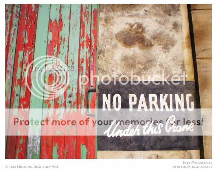
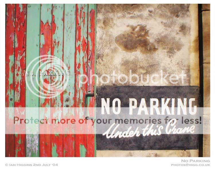
I initially took the pic as i liked the contrast of colours on the paint and i loved the old style of 'painted on' signage... I'm starting a project on Bradford, West Yorkshire, where i work and i want to show there still is colour and a positive 'sense of being' to it as well as a well established history...
Firstly, what do you think? secondly, could i have done something else to enhance it in anyway?
I initially took the pic as i liked the contrast of colours on the paint and i loved the old style of 'painted on' signage... I'm starting a project on Bradford, West Yorkshire, where i work and i want to show there still is colour and a positive 'sense of being' to it as well as a well established history...

![[No title]](/data/xfmg/thumbnail/40/40414-0d191cae467ae156374e5d8744c94b85.jpg?1619739465)


![[No title]](/data/xfmg/thumbnail/38/38735-2245cc1b04db3f96fa74095ae14558a6.jpg?1619738703)

![[No title]](/data/xfmg/thumbnail/38/38734-a0c4ec46a440db881aca3700b0c62879.jpg?1619738703)

![[No title]](/data/xfmg/thumbnail/35/35878-753a9d58c095f0e1aaa96d03c025f6ce.jpg?1619737205)