Noob seeking opinions.

bentcountershaft

Been spending a lot of time on here!
Joined
Nov 1, 2009
Messages
2,551
Reaction score
1,061
Location
Southern Indiana, USA
Can others edit my Photos
Photos OK to edit
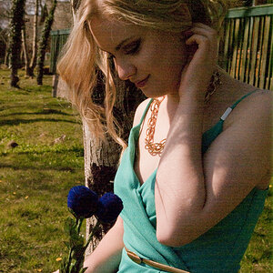
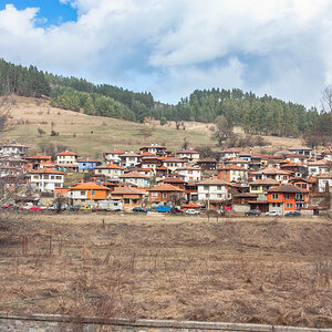
Hi, I've recently gotten into photography and I'm hoping for some opinions on how I've done so far. I'm using a little Sony Steady Shot with auto settings, so the technical side of things is a little outside of my grasp for now but I'll work on that in the future. For now I'm trying to teach my eye so to speak so any input on my composition skills at this point would be greatly appreciated. Thanks in advance, Mick.

1.
dsc03426b.jpg


2.
dsc03291b.jpg


3.
dsc02920w.jpg
 
C&C per req:

1. This is an interesting image, lots of lines and angles, but I'm not sure that a monochrome (B&W) treatment is best for this image. I think too that perhaps there might be an interesting image or two just in the stairs, what with the texture of the wood, the carving etc.

2. I like this idea. A nice pattern shot, but I would suggest cropping more tightly so that you only have two or three of the docks visible; the grass, fence and excess water adds little to the image. As well, notice that your highlights are over-bright. I think a polarizing filter would have taken this image from nice to very nice.

3. I'm afraid I get nothing from this image. The large dark areas image right and centre background are very distracting. Perhaps a close-up on the guardrails might have made for another interesting pattern shot.

Just my $00.02 worth - your mileage may vary.

~John
 
Thanks for the reply. I see what you mean about not doing the b/w on the first one, I just liked the way the wood grain looked so I went with it.

The second one I never really noticed but I think you're right. I think I was afraid to focus solely on the docks because of the lack of color. The over brightness is my post work fault. For some reason I go a little over board in that dept. Sometimes I like the sparkling quality of it and lean a little too hard in that direction.

The third I always get a mixed reaction on from my family/friends. Some people like the different textures, some think it's a whatever shot with a sign in the way. I certainly appreciate your taking the time to check them out and chime in though, so thanks again.
 
I like the B&W of #1. It's a study of line and texture.
I would crop out the stairs, though.

I like #3 also, but I find the sign distracting. See what you think, cropping to just below the yellow sign.
 
Thanks, I tried several shots that day (referring to the first pic) so I'll post another:

dsc03405b.jpg


On the third one, I tried that, but then I had the sign post going to nowhere and it annoyed me too much, but thanks again.
 
On the third one, I tried that, but then I had the sign post going to nowhere and it annoyed me too much, but thanks again.
Yeah, but it's less of a distracting element that a yellow sign with words that are chopped. You could crop it down, and some off the left to get the pole off of dead center, and you might find the image to be much more pleasing. I'd show you, but your profile is marked "Do Not Edit Mah Pikturz".
 
More like this?:

dsc02920c.jpg
That's better, but I would consider cropping the right side at where the bridge goes off at an angle. I think that trailer is more of a distraction than anything else.

On the first one, I like the stairs. However, I would consider shifting the composition so the lies are running more diagonally.

I would definitely crop that first pier out of the second one.

I like the fourth one.
 
Well since your trying to teach your eye remember the rule of thirds. Second if your walking, driving, biking what ever it maybe and you say oh that would be a great picture. It may not be that great through the view finder of the camera. Look at every picture through the view find and see if you can express what you saw and like to us.

Looks like you might like abstract art and architecture photography with the lines you have in your photos. You might check out some books on architecture photography and how to compose of it.

Great start. I like the black and white a lot. The others well keep up the good work. Take care.
 

Most reactions

New Topics

Back
Top