
Keta
TPF Noob!
- Joined
- Feb 11, 2006
- Messages
- 70
- Reaction score
- 0
- Location
- Vancouver, BC, Canada
- Website
- www.ketadesign.ca
- Can others edit my Photos
- Photos OK to edit
A while ago I asked for advice on framing / composition; I hope I have learned a thing or two from the responses!
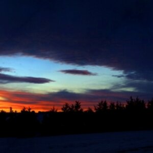
This is an extension of the same question . . . I'm basically looking for all and any kind of critique / advice / suggestions. This is a pic of my town on a semi-cloudy afternoon; I was going for a certain effect of depth / space + keeping the stronger foreground of the soccer players.
But I really don't know what the hell I am doing! Minor tinkering in PhotoShop re: light-contrast values and colour saturation.

(if you think this sucks really bad, please forgive me. Generally I take pics of eagles flying by so I'm not used to actually being able to compose a shot!)

This is an extension of the same question . . . I'm basically looking for all and any kind of critique / advice / suggestions. This is a pic of my town on a semi-cloudy afternoon; I was going for a certain effect of depth / space + keeping the stronger foreground of the soccer players.
But I really don't know what the hell I am doing! Minor tinkering in PhotoShop re: light-contrast values and colour saturation.
(if you think this sucks really bad, please forgive me. Generally I take pics of eagles flying by so I'm not used to actually being able to compose a shot!)
")


![[No title]](/data/xfmg/thumbnail/31/31977-2b717e032201241cbeae8226af23eba4.jpg?1619735136)
![[No title]](/data/xfmg/thumbnail/34/34072-be456691237ae73cb2936416e2e9e8c0.jpg?1619736266)

![[No title]](/data/xfmg/thumbnail/34/34071-9d82cc63ea930e951f24480c250e35d1.jpg?1619736266)