Oh So Subtle

JonK

I want MORE!!
Joined
May 19, 2005
Messages
3,568
Reaction score
140
Location
Manitoba, Canada
Website
www.jonkilimnikphotography.com
Can others edit my Photos
Photos NOT OK to edit
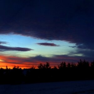
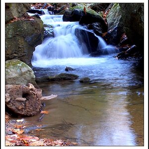
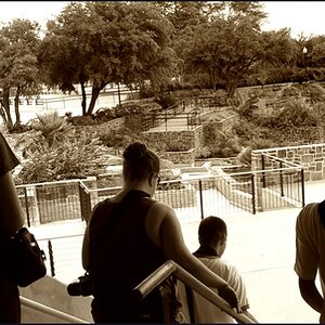
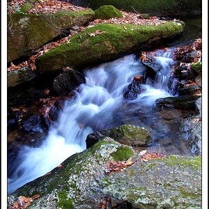
More of October's palette :)

1 -
sugtle-3.jpg


2 -
sugtle-2.jpg


3 -
sugtle-7.jpg


4 -
sugtle-4.jpg


5 -
sugtle-1.jpg


6 -
sugtle-6.jpg


7 -
sugtle-5.jpg
 
I love number 3, the colour and the bareness of the twigs is very evocative of this time of year. I also like #6 - a little bit like fire, but more gentle, muted.

Thanks for letting us see
 
Cool shots JonK. My fave is number 3 also.
 
They all have a beautiful tone to them, but I'm throwing in with the #3 bunch - just a great shot. :thumbup:
 
Dam good photos JK :thumbup: Very stylish. #2,5 and 6 are definately JonK photos, your images are always interesting to view. You really have a Trademark on the blur stuff too.
 
mcb said:
i don't know if it's just me, but i really can't seem to find a point of interest in any of these photos. good concept .. just not catching onto me.
That's partly why I've posted them all together in a themed thread...the theme being the subtle tones of October.
On their own each one can't really stand strongly with a clear subject.
Hoping people can just appreciate them for their subtle variations in tone and in the case of a few of them, their abstract nature.

Thanks for commenting. :)

And thank you to all of you for checking this thread. :D
 
I like the subtle "colour lining" in the first with areas of pale yellow at the bottom, pale green in between, and pale orange on top.
And I like the third because of its DOF.

They should be put up as a collage, to show that you mean for them to be TOGETHER. That would help the fact that few of them could really stand for themselves.
 

Most reactions

New Topics

Back
Top