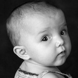
one Question. I will be shooting 2 (Very amature) Photo shoots this weekend. I would like to know how you can get that flash in the eyes w/o flooding out the rest of the photo?
Hey Russrom, i'll just give you the Exif data. This was shot f/16 1/250 iso 100.
The was shot with 1 soft box positioned 45 degrees to your RHS and slightly higher than the model. I metered for the brightest part of the face (which was her forehead). The one soft box will give you a nice subtle light and positioned 45 degrees you're not going to create a split effect, you're going to get enough light on the other side to give the shot a bit of depth. Look for the catch lights in the eyes, they should be around 2 o' clock. Let me know how you get on.
Problem is I do not have a soft box light, I have Flash 2 13" umbrella! The explanation helps but I don't have the equip, guess what my next purchase will be!!!
(I have been planing on getting the box lighting anyway!)
Aww thanks a million all. I'm only shooting 6 months so i still have alot to learn. I'd like to start taking some formal courses to brush up on the technical side of things. The black and white dots are airbrushed on.
I like the lighting and I think it's a good shot, but there are a couple of things that are a little off for me. The crop is too close to her eyes. My own eyes keep getting drawn away from them and down to her better lit shoulder. If this is cropped, I'd try it with more forehead. If it's not, then I would crop off the bottom and left so her eyes are more "in" the image.
And while I like the light, the high tones seem to be lacking. Looking at the histogram...
we can see that almost the top 5th of the tonal range is missing. We could move the white point down, which I commonly do, here it messes up the highlights in her lips. Moving the grey point to the left (as shown) shifts the tonal range though, and works well. You could also use curves to bring up the upper range with a little more control and boost the contrast slightly.
Let me know if you'd like to see an edit of what I had in mind. Not saying it's better, but something to consider.
I really, really like this one! I also agree that it would fit on a magazine cover. But, for my own personal taste, she seems a little "grey". Otherwise, stunning photo.


")


![[No title]](/data/xfmg/thumbnail/35/35968-01893eeb6a205c00827118fe5bb79703.jpg?1619737286)


![[No title]](/data/xfmg/thumbnail/35/35966-4f59fb71a71adfe775ae568f8c534699.jpg?1619737283)
![[No title]](/data/xfmg/thumbnail/41/41764-1385c153e9fea917b7efea0bbde7eefe.jpg?1619739885)
![[No title]](/data/xfmg/thumbnail/39/39185-29433e4f46e4b0bd394d10962886594c.jpg?1619738904)