lazarus219
TPF Noob!
Hi,
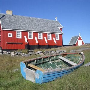
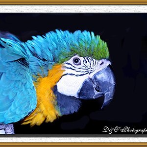
I posted this on another forum- didnt get any replies out of 60 views though. I personally like this shot but i thought i might get some critique because as ive noticed- what i think looks good is usually what i take so i like most of my photos
Any critique welcome!

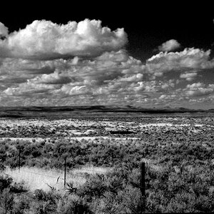
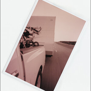
Another shot i got, the theme for the months photo contest on another site is solitude- i noticed this grave looked really alone and shot it for that. I probaly won't use it but any comments?

Thanks!
[EDIT] sorry about the large size of the second
I posted this on another forum- didnt get any replies out of 60 views though. I personally like this shot but i thought i might get some critique because as ive noticed- what i think looks good is usually what i take so i like most of my photos
Any critique welcome!
Another shot i got, the theme for the months photo contest on another site is solitude- i noticed this grave looked really alone and shot it for that. I probaly won't use it but any comments?
Thanks!
[EDIT] sorry about the large size of the second
")
![[No title]](/data/xfmg/thumbnail/31/31708-69f4ec98ec000d4fc9a9a1cc282e8e16.jpg?1619734965)