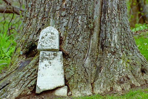
Looking for honest critique, maybe even with reasons as to why you do or don't like it. In my opinion, the colors aren't all they could be...problems with composition?
First crop: Too much tree and it's hard to tell the stone's the subject.
Second crop: Better, but the center weight of the frame doesn't add a lot of interest. In addition, the bark of the tree really competes with the stone for attention here.
Suggestion: Try just focusing on a small portion of the stone, like the cracked area, for instance and see what you get. Sometimes focusing on a little piece of a larger scene is more interesting than an all-over shot.
On the colors, really I think all you need to do is boost your saturation a bit and that will help.
I agree with neal on the crop issues, but I do think you wound up with a relatively uninteresting starter subject... looks like the stone itself doesnt even have that much detail to it.
However, I personally find graves and tombstones fascinating... and I am never able to quite make a shot of them that I find to be really neat. In person, they are totally cool looking... on "film" they just seem to go all flat. I am very interested to see what anyone here says about how to make cemetary stuff work.
Thank you all for the comments/critique. Maybe I'll go out and try re-shooting it with a polarizing filter (once I get one). And I'll try a few different angles...maybe get it to work.
It's just interesting to me because the grave is so old that it was pushed over by the tree that has now grown over the headstone...
That is very interesting..
Perhaps take it again like in shot #2 but with shallow DOF so you dont' get the grass background so sharp..
Then write something catchy above it to describe what has happened it should be much more powerful that way.. Plus maybe some added contrast.
If there is any writing on the stone at all really work on trying to get that in the picture.
I would suggest a crop on the 2nd one to put the headstone on a 1/3 - ie remove some of the left.
Exposure needs to be less, not to blow out the bottom of the stone.
I think you have an interesting subject worth exploring more
Good luck!
Yes I think that is much better - composition wise and also colour and tones
So why, out of interest, didnt you correct for colour & tones in your initial posting? - as it really makes a difference.
Yes I think that is much better - composition wise and also colour and tones
So why, out of interest, didnt you correct for colour & tones in your initial posting? - as it really makes a difference.
The only reason I didn't edit it in the first place is because I am very new to phot editing. I wasn't even sure how to make it look "better". I guess I wanted to know what people thought was wrong with it so I knew what to fix by editing it...


![[No title]](/data/xfmg/thumbnail/36/36301-27972c0474532c2ef657014362950733.jpg?1619737495)


![[No title]](/data/xfmg/thumbnail/39/39501-c3f6a664311b0a3868b613f963809fb1.jpg?1619739058)
![[No title]](/data/xfmg/thumbnail/39/39500-340f9581ccea2902f4cca7c656232f9e.jpg?1619739057)