Tim Tucker
No longer a newbie, moving up!
- Joined
- Mar 23, 2015
- Messages
- 660
- Reaction score
- 579
- Can others edit my Photos
- Photos NOT OK to edit
On a recent thread in the Landscape forum an interesting, (though by no means new), idea came up which I would like to discuss further:
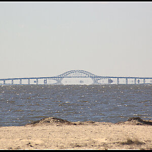
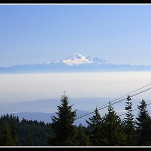
Just after sunset
My comment was:
...we sometime get too settled in the tools and habits we use in photography and miss what may be beyond it. By this I mean if you judge composition by the metrics that you understand then you fall into a pattern of seeing the image only in relationship to those metrics. You may tend to look at horizon lines and talk of thirds and may not see the pattern of dark/light/dark horizontal bands that give just enough asymmetric balance around a near central horizon and neatly divide the image into 3rds. Moving the horizon to the 'rule of thirds' (ROT) makes no sense as it totally destroys the rhythm of thirds that you have given the image. All it does is serve the metric that it is the horizon that is placed on the ROT because such is the habit that is formed.
To expand on this a little further, because we may form the habit of it being the horizon line on the ROT then are we specifically looking for the horizon line to determine it's placement in an image? And what do we achieve by doing this? Is it really composition or simply placing an order on an image which we recognise and understand as photographers?
Again with no disrespect to the talents of the photographers involved, there is no dead space in the sky of the image reference in the thread. It balances beautifully the dark areas at the bottom of the image. It only becomes dead space to support the habit of the placement of the horizon on the ROT and because of the habits we form we can become blind to the other possibilities.
This does not only apply to the ROT but it also, I think, to the whole range of tools at our disposal. When we post process an image we understand a logic attached to the sliders and functions of the programs. That logic of how we perceive these tools to function then becomes the framework by which we judge images. We tend to see images with reference to our understanding of the use of these tools, "I see and understand what you've done here..." But does a non-photographer with a different framework of understanding see the same? Some photographers I've seen, (on another site), tone map and sharpen the whole image into the same even micro-contrast, then boost the contrast and saturation to overcome the degraded colour, and thus strip out the last remaing pastels and variations in tint and shade. Black is then added in abundance, "to bring out the colour," because the only way to hide a relative lack of colour is by contrasting it with a complete lack of colour. So a flat, lifeless and relatively colourless (though vibrant) image gets likes because it's good or because it conforms to the metrics of other photographers who maybe can't see past their perceived logic of the tools they use?
Now I would still like to explore our perceptions of colour further with "Tomatoes Pt2" at a later date.
As I read in a book once:
"No education is authentic if it leaves such habit undisturbed."
So let's shake it up a bit, and one way I try to shake it up is to turn the subject on it's head and approach it from another angle. With composition we are effectively creating order, so let's consider the question, "how do we create randomness or disorder in our images?"
If we look at the landscape around us we see both organised structure and a randomness. But how many often see the shape of a human face in the random patterns around us? This is because our eye actively seeks recognisable patterns in the chaos around us. We seek to apply scale, logic, and understanding to what we see, how far away it is, what it is, and how it relates to it's surroundings.
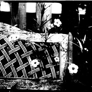
Below is a seemingly random collection of shapes:

Now the trouble with photography is that we impose upon this randomness a rectangle, we supply a grid upon which the eye can judge distance and discern pattern. We can easily split the grid into halves, thirds, diagonals and many more patterns. To see just how powerful this rectangle is at providing an order to that contained within, and just how much it scuppers our plans to create randomness, scroll down to the image below, (I've deliberately put it at the bottom as I don't want you to see the two images together).
By imposing a grid on the random shapes we provide a framework for the eye to perceive order, some might even begin to discern scale and distance simply because of it's addition.
Now this really does work against us creating a random pattern within our rectangle because no matter how randomly you place the objects the eye will always seek to impose order. To see how artists have overcome this I'm going to switch to jazz for a while.
Imagine an old jazz favourite, say "Blueberry Hill." Now to many I'm guessing that the basic melody is so familiar it is akin to comfy slippers. In fact many are so familiar with it that a straight rendition, similar to when it was first heard and caused excitement, would now seem relatively boring and staid to us. Such is the development of our ear to new concepts and sounds over time. Now if you listened to a modern progressive jazz interpretation of the same tune you many get lost and hear a barely tuneful and rhythmic randomness. But try listening to the same tune while you hold the original melody in your head. This is what the jazz musicians are doing, they know the tune so well that they are no longer playing it. It is hidden and exists within their heads. What they are playing is the accented rhythms and the tension and release across the top of it.
This is what artists do. To create randomness they hide the basic structure (the tune) within the rectangle, they then play out the beats and accents set deliberately against this hidden rhythm. You can see this in one of it's masters, Degas. Have a look at his "The Absinthe Drinker":
L'Absinthe - Wikipedia, the free encyclopedia
You may think it's random. But ask yourself why the tables have no legs. This is not neglect but the biggest hint that the image is highly and very deliberately structured. Degas deliberately sets out a hidden or latent rhythm against which he plays the very carefully placed accents or off-beats. Composition is not just about the absolute, the lines and logic you perceive, but can also be split into visible and latent structure. To gain full control over this requires a measure of understanding, but that does not exclude anybody achieving it by 'eye' alone.
What is interesting is that the impression of randomness needs to become highly structured simply by the addition of a rectangle around your image.
I do not expect you to fully agree (or even understand) the ramblings within my head, but I do hope that another's perspective might give some a different view and allow them to see around some of the habits we form.

Just after sunset
My comment was:
...we sometime get too settled in the tools and habits we use in photography and miss what may be beyond it. By this I mean if you judge composition by the metrics that you understand then you fall into a pattern of seeing the image only in relationship to those metrics. You may tend to look at horizon lines and talk of thirds and may not see the pattern of dark/light/dark horizontal bands that give just enough asymmetric balance around a near central horizon and neatly divide the image into 3rds. Moving the horizon to the 'rule of thirds' (ROT) makes no sense as it totally destroys the rhythm of thirds that you have given the image. All it does is serve the metric that it is the horizon that is placed on the ROT because such is the habit that is formed.
To expand on this a little further, because we may form the habit of it being the horizon line on the ROT then are we specifically looking for the horizon line to determine it's placement in an image? And what do we achieve by doing this? Is it really composition or simply placing an order on an image which we recognise and understand as photographers?
Again with no disrespect to the talents of the photographers involved, there is no dead space in the sky of the image reference in the thread. It balances beautifully the dark areas at the bottom of the image. It only becomes dead space to support the habit of the placement of the horizon on the ROT and because of the habits we form we can become blind to the other possibilities.
This does not only apply to the ROT but it also, I think, to the whole range of tools at our disposal. When we post process an image we understand a logic attached to the sliders and functions of the programs. That logic of how we perceive these tools to function then becomes the framework by which we judge images. We tend to see images with reference to our understanding of the use of these tools, "I see and understand what you've done here..." But does a non-photographer with a different framework of understanding see the same? Some photographers I've seen, (on another site), tone map and sharpen the whole image into the same even micro-contrast, then boost the contrast and saturation to overcome the degraded colour, and thus strip out the last remaing pastels and variations in tint and shade. Black is then added in abundance, "to bring out the colour," because the only way to hide a relative lack of colour is by contrasting it with a complete lack of colour. So a flat, lifeless and relatively colourless (though vibrant) image gets likes because it's good or because it conforms to the metrics of other photographers who maybe can't see past their perceived logic of the tools they use?
Now I would still like to explore our perceptions of colour further with "Tomatoes Pt2" at a later date.
As I read in a book once:
"No education is authentic if it leaves such habit undisturbed."
So let's shake it up a bit, and one way I try to shake it up is to turn the subject on it's head and approach it from another angle. With composition we are effectively creating order, so let's consider the question, "how do we create randomness or disorder in our images?"
If we look at the landscape around us we see both organised structure and a randomness. But how many often see the shape of a human face in the random patterns around us? This is because our eye actively seeks recognisable patterns in the chaos around us. We seek to apply scale, logic, and understanding to what we see, how far away it is, what it is, and how it relates to it's surroundings.
Below is a seemingly random collection of shapes:
Now the trouble with photography is that we impose upon this randomness a rectangle, we supply a grid upon which the eye can judge distance and discern pattern. We can easily split the grid into halves, thirds, diagonals and many more patterns. To see just how powerful this rectangle is at providing an order to that contained within, and just how much it scuppers our plans to create randomness, scroll down to the image below, (I've deliberately put it at the bottom as I don't want you to see the two images together).
By imposing a grid on the random shapes we provide a framework for the eye to perceive order, some might even begin to discern scale and distance simply because of it's addition.
Now this really does work against us creating a random pattern within our rectangle because no matter how randomly you place the objects the eye will always seek to impose order. To see how artists have overcome this I'm going to switch to jazz for a while.
Imagine an old jazz favourite, say "Blueberry Hill." Now to many I'm guessing that the basic melody is so familiar it is akin to comfy slippers. In fact many are so familiar with it that a straight rendition, similar to when it was first heard and caused excitement, would now seem relatively boring and staid to us. Such is the development of our ear to new concepts and sounds over time. Now if you listened to a modern progressive jazz interpretation of the same tune you many get lost and hear a barely tuneful and rhythmic randomness. But try listening to the same tune while you hold the original melody in your head. This is what the jazz musicians are doing, they know the tune so well that they are no longer playing it. It is hidden and exists within their heads. What they are playing is the accented rhythms and the tension and release across the top of it.
This is what artists do. To create randomness they hide the basic structure (the tune) within the rectangle, they then play out the beats and accents set deliberately against this hidden rhythm. You can see this in one of it's masters, Degas. Have a look at his "The Absinthe Drinker":
L'Absinthe - Wikipedia, the free encyclopedia
You may think it's random. But ask yourself why the tables have no legs. This is not neglect but the biggest hint that the image is highly and very deliberately structured. Degas deliberately sets out a hidden or latent rhythm against which he plays the very carefully placed accents or off-beats. Composition is not just about the absolute, the lines and logic you perceive, but can also be split into visible and latent structure. To gain full control over this requires a measure of understanding, but that does not exclude anybody achieving it by 'eye' alone.
What is interesting is that the impression of randomness needs to become highly structured simply by the addition of a rectangle around your image.
I do not expect you to fully agree (or even understand) the ramblings within my head, but I do hope that another's perspective might give some a different view and allow them to see around some of the habits we form.
")


![[No title]](/data/xfmg/thumbnail/34/34686-9d6b51a2427064204f762b07c8b00f70.jpg?1619736602)