Opinion on a divisive photo.

tmyprod

TPF Noob!
Joined
Oct 25, 2008
Messages
107
Reaction score
0
Location
Seattle, WA
Can others edit my Photos
Photos OK to edit
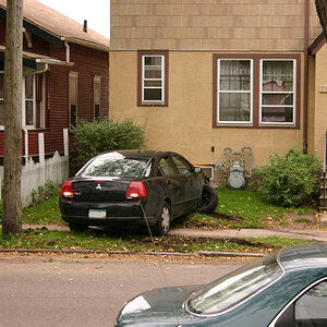
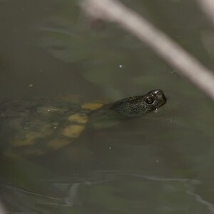
So, I recently got some film developed and posted what I felt were some of the better shots on 4chan's /p/ board (something about having a roomful of people call all my shot's crap motivates me to take better photos), but one of the pics I posted caused quite an uproar with some calling the shot terrible (in slightly more "colorful" terms) and others calling it great.

I just wanted to get a slightly more civilized opinion on the photo.

3561603192_6f35668804_o.jpg


I'll post some more of my last roll or two if you're interested.

-Tmyprod
 
I like the subject, but there is WAY WAY WAY too much sky there for my liking. It adds absolutely nothing to the picture in my opinion.
 
I took others with varying amounts of "white", this on just caused the biggest stir.

Here's another (for example)

3567869625_9d54cff12b_o.jpg
 
Since I am not a beginner, I should not perhaps be commenting in this thread.
Nevertheless, I agree with Seward. The sky really does not contribute to the shot and some of it needs to be cropped out. A photographic approach to get a better sky and a little more detail in the foreground would be to use a graduated neutral density filter.

However, I think it is a good shot. Composition-wise, you have made interesting use of the shapes of the rocks and the jagged water path leads into the photo which adds to its effectiveness.

I would prefer colour to black and white, since quality black and white shots require great detail and numerous tonal variations between deep black and strong whites.

The shot works so I don't see why anyone would think it was terrible.

skieur
 
Composition of the rocks and beach itself is good...............there is a lot of sky, but then doesn't it really say something about the barren location..
Take a look at some of the progressive photograpers of the decades......There are plenty of examples of lot's os space leading to the subject.

Although from a purely technical "rule" perspective, you could pigeonhole this photo..
Also too, from a creativity perspective, it may not be my personal style, but I could see it on a poster size wall hanging...
 
I would prefer colour to black and white, since quality black and white shots require great detail and numerous tonal variations between deep black and strong whites.

It IS shot in color, it was just a gray day.


Also:
I don't consider myself a "beginner", but this the most active section of the forum.
 
Well, here are some more shots from that reel.

1)
3561605262_c58aa795f5_o.jpg


2)
3560788035_14ed1c5c8e_o.jpg


3)
3560789247_d1de41dd1c_o.jpg


4)
3560789499_92bac937c2_o.jpg


5)
3560789935_5c58e4c587_o.jpg


6)
3560788819_d7e235c3ec_o.jpg


The film was Kodak ISO 200 and it was developed and scanned at Walgreen's (a drugstore, in case you haven't heard of them) so, don't judge the scans too harshly.

As always, C&C is encouraged and appreciated.
 
Wow! #2 is really cool!
I like #1 too. I think the amount of sky works much better with it.

#3-4, meh.
#5 Your focus seems to be on the small leaf, which just looks odd to me as a whole.
#6 Nice sunset.
 
#4 I love it, because she hates it so much.

#5 It was windy and that son-of-a-***** branch wouldn't hold still.

#6 was a sunrise. It was taken just east of the VLA in New Mexico, which of course we drove by in the dark.
 
I personally like them all. You could probably crop #1 a bit, but it's definitely not terrible. Let the naysayers keep on blabbing because in the end, that's all it is.. BLABBING
 
Sorry, sunrise. LOL

I've never seen one, so i wouldn't know ;)
 
That was one of the better sunrises on that road trip. We drove from Seattle to Texas and back, never once hitting the same road twice.
 
there was a major exhibit in houston . . . one of the shots was 4/5s sky, with the bottom half being ocean, with only the horizon and slight amounts of whitecaps in the water making a discernible difference . . . so i would venture to say there is a certain appeal to negative space out there.
 
Are you thinking of this image by Hiroshi Sugimoto?

34f4b14f963601230a4d5edfb13c3c65_large.jpg
 
#2 is wonderful.

#1 is nice. I guess, in part, it depends on what feeling you want to convey. All that sky (versus less sky) does change the mood of the image, for me at least. Do you like it? Does it serve whatever purpose you intended it for?
 

Most reactions

New Topics

Back
Top