Optical Dispensary

terri

Administrator
Staff member
Supporting Member
Joined
Sep 2, 2003
Messages
34,511
Reaction score
7,539
Location
In the mental ward of this forum
Can others edit my Photos
Photos NOT OK to edit
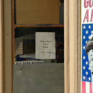
This is an image of a optician's storefront. I used Kodak HIE (infrared) film and toned with Berg's blue. Then I outlined the letters with photo oil pencil. I had fun with this one. :)

3387255523232%7Ffp3%3B%3Dot%3E2323%3D538%3D%3B6%3B%3D3232538%3A7%3A%3C5%3Cnu0mrj
 
please be patient....I'm learning icon_smile.gif

get rid of that signature - you have a good composition eye and are creative.

this is well composed and exposed and printed. it's a personal thing, but i dislike coloring of photographs. looking past that, it's a shot well done. the jutting black perpendicular at the llc weighs it nicely and gives it depth.

nice.
 
ha ha!! No, I am a beginner, I promise you.... for every nice image I have there is a stack of plonk next to it. I want to get to a point where I believe the stuff I do isn't just a happy accident, you know???

But thank you. Really. I've always liked this one.

When I first learned hand tinting, I was drawn to it because I prefer what I called the minimalist approach....selective coloring of B&W images. My instructor of 6 months was just the opposite and I think I got brainwashed. :shock: I love pure B&W imagery and shoot a lot of infrared, and am just now relaxing into not feeling I HAVE to throw some damn color onto it!!! :wink:
 
Here you go.... I knew I had this floating around somewhere.... might be a tad dark, but you get the idea.

3387258%3B23232%7Ffp47%3Dot%3E2323%3D538%3D%3C28%3D3232538%3B37989nu0mrj
 
AHHHH..thanks. my monitor is calibrated, so it looks just fine.

the white of the neon against the dark shadows would've looked just dandy on the blue tone.......

........pink.

*ahem*
 
"pink..." lmao!!!

Hey, you should see it matted and framed...... it rocks, bay-bay!!! :goodvibe:
 
ha ha!! No, I am a beginner, I promise you.... for every nice image I have there is a stack of plonk next to it. I want to get to a point where I believe the stuff I do isn't just a happy accident, you know???

oh man... that totally could have been me talking. :wink:
 
Do you hate the pink lettering, too, Carlita? Just curious, I won't be offended, promise....

the problem I encountered with this is, it's selective toning, meaning I had to mask off all the pure black areas that are left. To keep the letters pure white I'd have had to dab the mask over them as well. And I'm lazy. They came out kinda puke-blue after toning. My first thought was to color them yellow, but yellow and blue make you-know-what :mrgreen: so I moved on.

It's called deco pink, I believe. woo-hoo!! :wink:
 

Most reactions

New Topics

Back
Top