Original or Cropped?

HikinMike

No longer a newbie, moving up!
Joined
Nov 6, 2009
Messages
1,438
Reaction score
147
Location
Atwater, CA
Website
www.imagesinthebackcountry.com
Can others edit my Photos
Photos NOT OK to edit
I figured I'd post this here because most people go to this section. ;)

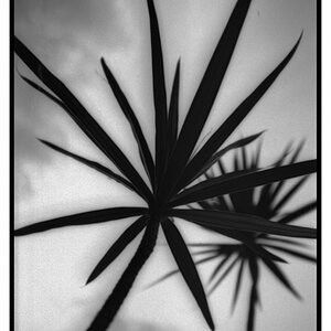
I already have the full size (original) on my website/gallery for purchase, Wintertime at Tioga Lake. But, the bottom portion of the image has always bothered me. When I first composed this, I wanted to include the rock because there were a couple of Gulls. Honestly I don't think it adds anything and the open water is actually a distraction IMO. So being bored, I cropped it as a pano format and decided to convert that one into a B&W too.

Thoughts? BTW I used a 5D, 70-200mm f/4L with these.

_MG_8775.jpg


01-067_pano.jpg


01-067_pano_bw.jpg
 
Cropped

My eye is drawn to the rock in the original which is clearly not the subject, although I do like the little birds on it!
 
Cropped

My eye is drawn to the rock in the original which is clearly not the subject, although I do like the little birds on it!


agreed!
 
compositionally, the cropped version. though it may not be technically "correct" i like number one. it gives an open feeling.

awesome shot!
 
I'm going to disagree with the majority and say the uncropped version is better. It adds some foreground interest without being too distracting. The cropped version to me, just looks like a background. It's more visually interesting. Plus, if you look at the rock first, your eye is led along the crack in the ice to mountains. There's just nothing interesting about the cropped version, in my opinion.

I can't remember who said it, but I remember a quote that was something like "A good landscape shot is something in the foreground with an interesting background."
 
I think I like the cropped (color) version most.
 
I'm going to disagree with the majority and say the uncropped version is better. It adds some foreground interest without being too distracting. The cropped version to me, just looks like a background. It's more visually interesting. Plus, if you look at the rock first, your eye is led along the crack in the ice to mountains. There's just nothing interesting about the cropped version, in my opinion.

I can't remember who said it, but I remember a quote that was something like "A good landscape shot is something in the foreground with an interesting background."

Which is why I originally composed it....because of the rock/gull. But I'm on the fence about the open water being a distraction. :confused:
 
The foreground element is not dominant enough to add to the photo, the foreground distracts from the true subject which is the upper 2/3 of the photo.
If you could somehow have walked on water and gotten to within about 20 feet of the small island with the birds and from water level, then it would have worked.
 
I like the original with the rock in the foreground. It gives the photo more depth. And in the original there's more to define the lake, where in the cropped version the broken ice at the bottom looks disconnected because it's just a strip across the bottom.

It seems like if you wanted a photo like the cropped one you should be physically closer so there's more perspective in the trees.

In the original there's 3 phases of depth (lake with rock, trees, mountains) -- all calming horizontal lines. There's a portion of the lake in the cropped version, but feels there's not enough lake.
 
here's the thing... for me anyways. with photos like this, on the edge.

just bc there are "rules" whose really gonna enforce them or make you follow them? i like both.

personally, if i had one to hang on my wall id chose the original, it just is more interesting... whether technically correct or not... who cares? 99% of the people who would see the photo in my house wouldn't care.

yes i know, rules are rules... but on some occassions, they can be broken and i think it works here... if thats what you like.

edit: the original gives me the feeling im standing out there, in the vast open looking off into the mountains. more dimensional if you will.

the cropped feels like just a picture... while a very good one, doesnt intrigue me as much and is more flat. imho anyways.

they are both amazing, hope u dont take this the wrong way
 
I like #1. It held my attention the longest. I'm not sure why, but it may be because I can almost see 3 awesome photos that are merged into 1.
 

Most reactions

New Topics

Back
Top