thereyougo!
Been spending a lot of time on here!
- Joined
- Jun 1, 2010
- Messages
- 2,316
- Reaction score
- 1,991
- Location
- UK
- Can others edit my Photos
- Photos OK to edit
Some shots this morning while on my way to meet a local photographer friend and while shooting with him:
Sony A7RII Batis 18 f/2.8
1.
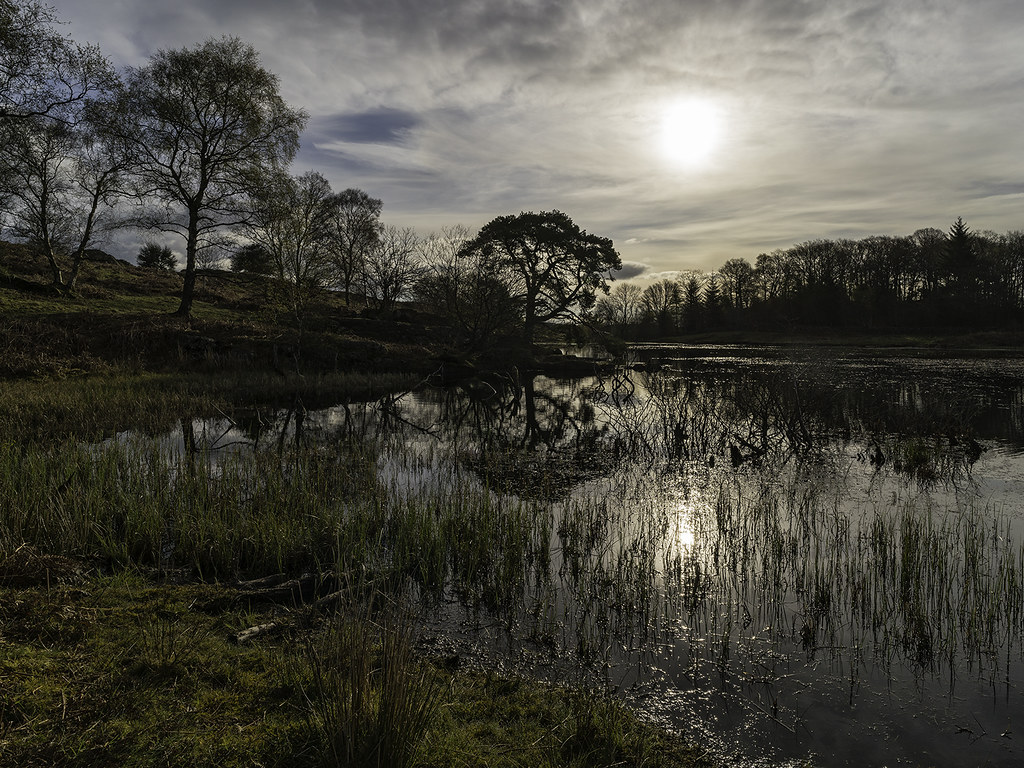 Lowhouse tarn copy by singingsnapper, on Flickr
2.
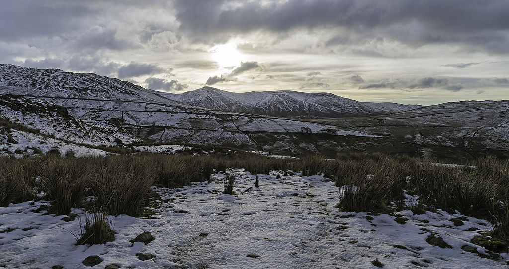
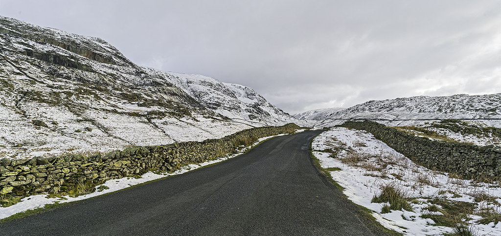 The Struggle in the snow copy by singingsnapper, on Flickr
3.
 High street from The Struggle copy by singingsnapper, on Flickr
4.
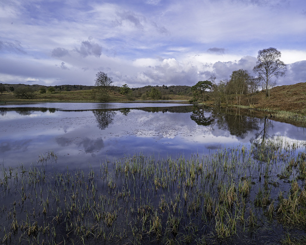 Lowhouse Tarn 2 copy by singingsnapper, on Flickr
These two Panos won't have the best justice at 1024px so on flickr there is an 8000px wide version of these: the first is 277mp and the second 185mp in their original form
A7RII FE 70 - 200
5.
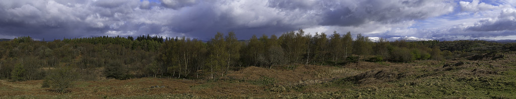 Lakeland Pano copy by singingsnapper, on Flickr
6.
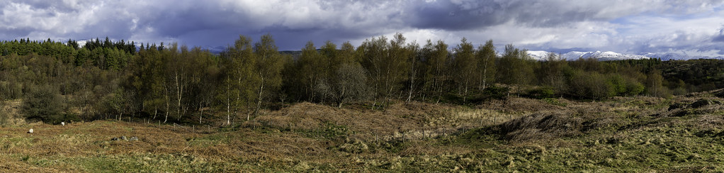 Lakeland Pano-2 copy by singingsnapper, on Flickr
Sony A7RII Batis 18 f/2.8
1.
Lowhouse tarn copy by singingsnapper, on Flickr2.
The Struggle in the snow copy by singingsnapper, on Flickr3.
High street from The Struggle copy by singingsnapper, on Flickr4.
Lowhouse Tarn 2 copy by singingsnapper, on FlickrThese two Panos won't have the best justice at 1024px so on flickr there is an 8000px wide version of these: the first is 277mp and the second 185mp in their original form
A7RII FE 70 - 200
5.
Lakeland Pano copy by singingsnapper, on Flickr6.
Lakeland Pano-2 copy by singingsnapper, on Flickr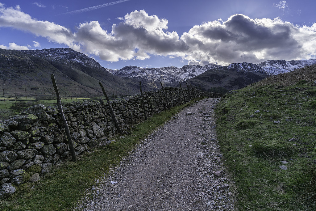 Head of Langdale copy
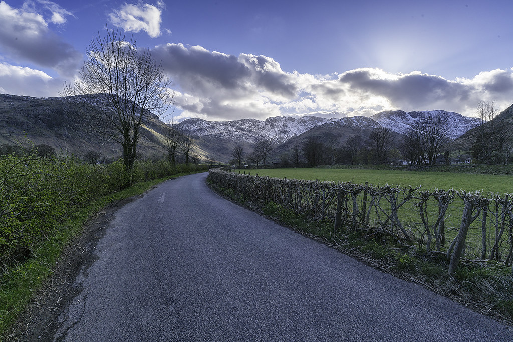 Langdale at Dungeon Ghyll copy
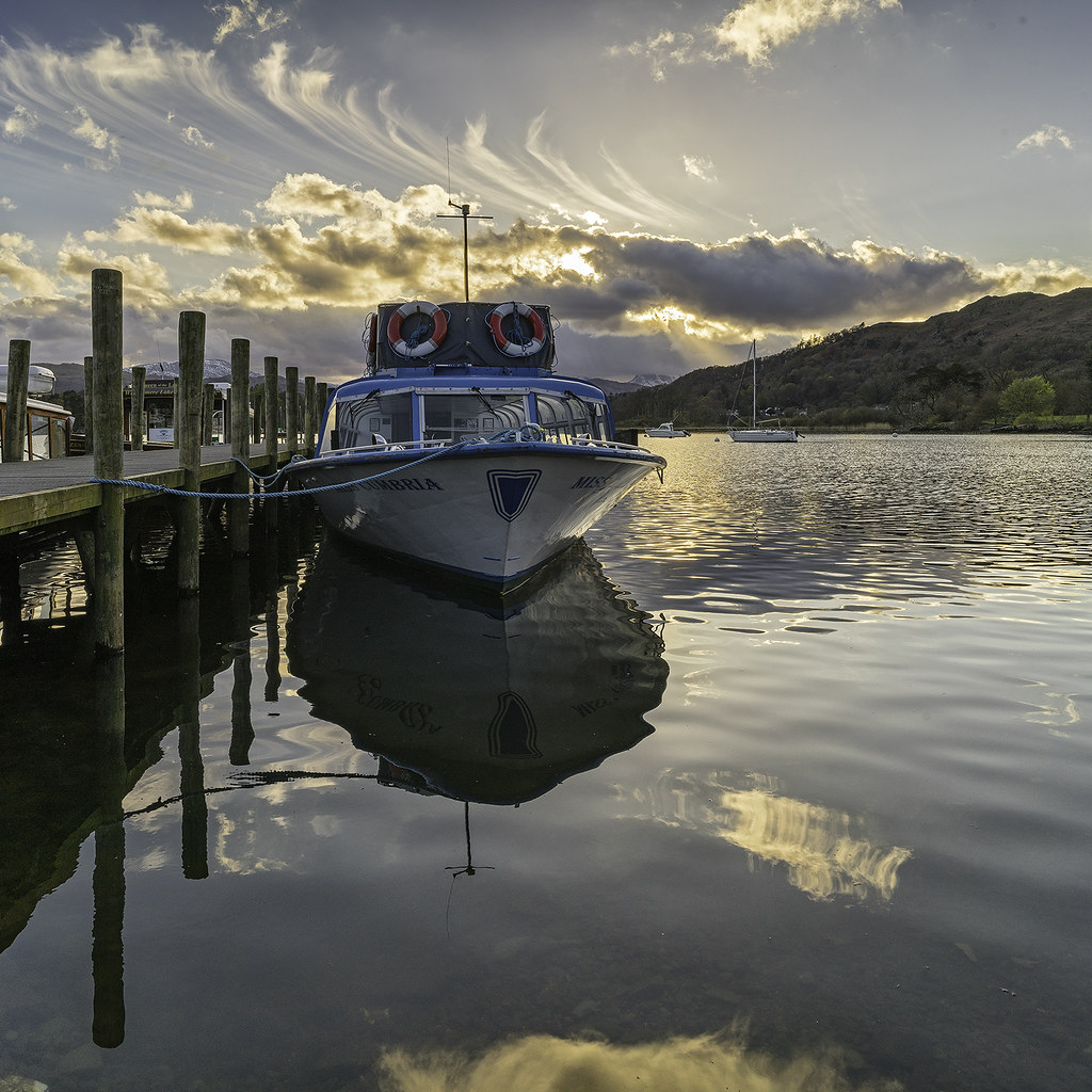 Miss Cumbria at Waterhead copy
") I can see why you'd want to bring the shadows up a bit, but overall, I prefer the more gentle feeling of this version.
I can see why you'd want to bring the shadows up a bit, but overall, I prefer the more gentle feeling of this version.

![[No title]](/data/xfmg/thumbnail/37/37526-bc41ead4d3f2330d3e37da95abf9132e.jpg?1619738130)