
had an assigment yesterday, he found our website on google, thanks to the hubby's web optimization  .. how cool is that 8)
anywho, he's a self-proclaimed computer "geek" and wanted some portraits to have of himself and for an online dating service... i talked him out of the studio and wanted to go for something more "natural" ... we used all natural lighting (at 12pm noon) ... i brought a reflector just in case but didnt use it
i shot these all in RAW mode/format, their a little more "rustic" looking than my normal stuff ... he kept talking a lot during the shoot so i had to wait or catch him with his mouth open. i used a tripod for some, but not always (i find tripods too restricting) you know the drill, comments, critiques welcome


.. how cool is that 8) anywho, he's a self-proclaimed computer "geek" and wanted some portraits to have of himself and for an online dating service... i talked him out of the studio and wanted to go for something more "natural" ... we used all natural lighting (at 12pm noon) ... i brought a reflector just in case but didnt use it
i shot these all in RAW mode/format, their a little more "rustic" looking than my normal stuff
... he kept talking a lot during the shoot so i had to wait or catch him with his mouth open. i used a tripod for some, but not always (i find tripods too restricting) you know the drill, comments, critiques welcome

![[No title]](/data/xfmg/thumbnail/31/31012-f5e0c7cdea2f2c3e44737e3f61c2461a.jpg?1619734567)
![[No title]](/data/xfmg/thumbnail/31/31011-439c1242fe08cf6b54f32bf06523a567.jpg?1619734567)

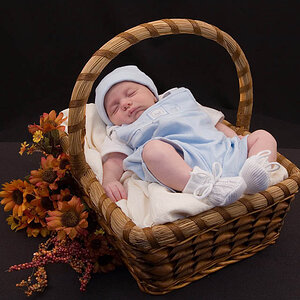
![[No title]](/data/xfmg/thumbnail/30/30889-6a35eb14fac2d7d837d49a6a1757d874.jpg?1619734500)