OP
OP
- Joined
- Mar 29, 2016
- Messages
- 14,856
- Reaction score
- 8,311
- Can others edit my Photos
- Photos NOT OK to edit
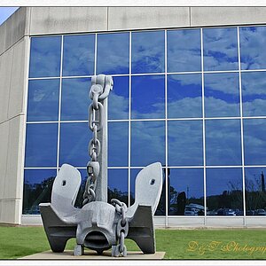
Congrats on living where vets are honored and rightfully so! We have had thieves steal the older bronze and brass flag holders from graves in areas close to me here and it makes my blood boil. If I caught someone doing this, I am sure I would spend some time in prison. It seems the concensus is that you have a nice image here, no matter what The_Traveler thinks
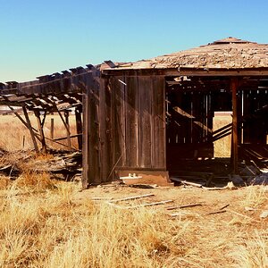
Thanks Dean. Many, many moons ago, we had a local photographer, that documented just about everything in the area. All in black and white, some good, some "vanilla documentation, lacking any creative input on the part of the photographer"
 When he passed away a few years ago, his collection of thousands of photos was donated to the local library. Whenever I get by there I always make time to view a few of them, to compare then and now. Looking at his collection, you quickly realize that not every image you take has to be an outstanding work of art. Sometimes you just want a memory of what was, and hope that someday, someone will look at it and say, "I remember that".
![[No title]](/data/xfmg/thumbnail/38/38738-7933157d1b8968c986eeeab2d1828524.jpg?1619738703)