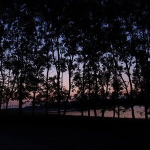
Eyecatcher
TPF Noob!
The colour version is just great!
Why put a flower, which we practically always choose for it's colour and appearance in a B/W picture?! Now that I find a pity.
Secondly, converting such a red colour to B/W gives about the most neutral (even dull) grey tone there is, you loose a lot by converting it.
To my opinion a light coloured flower or a darker coloured flower would have done more in B/W.
Peter