Peyto Lake - Edit#2

Jeff Canes

No longer a newbie, moving up!
Joined
May 19, 2003
Messages
6,194
Reaction score
28
Location
Hollywood, FLA USA
Website
www.pbase.com
Can others edit my Photos
Photos OK to edit
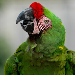
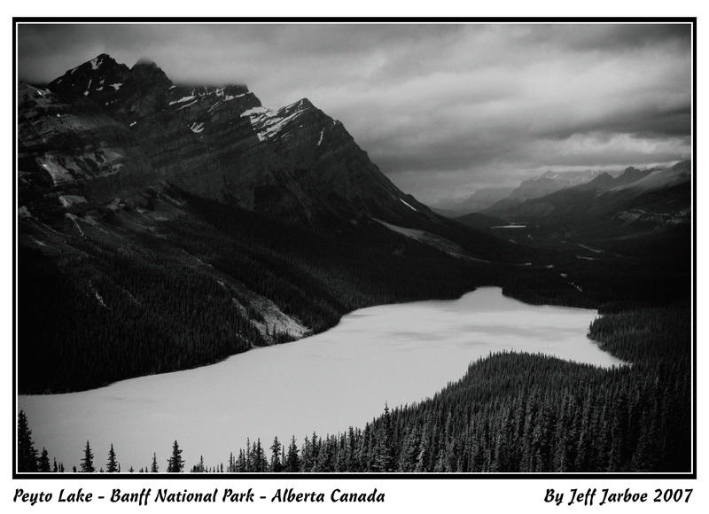
Is it too grainy, how’s the contrast, is it too dark (for me it looks fine at home but dark at work)

Also I edit both starting with color raw file
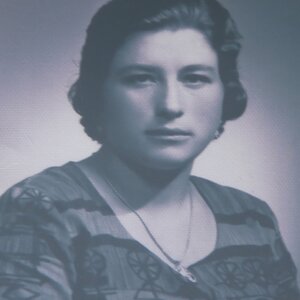
#2
[FONT=&quot]
Peyto_Lake_by_JeffJarboe.jpg
[/FONT]

116-grayscale.jpg


[FONT=&quot]edit #1[/FONT]
[FONT=&quot][/FONT]


edit #3
large.jpg
 
On my last visit to Canada I want hoping to get some classic style B&W images but my film camera acted up on the trip. So I when with my second option witch was to convert them to B&W from digital. This is not one of my favorite things to do. Because it a lot hard to get the look of film from digital that it is to just use film from the start.

I asked about grain, contrast and darkness. Because I believe that they are some of the key issues to the look I was trying to accomplish.
 
I like everything from Edit 1 except the water - it looks like a sheet of ice. I'd consider putting the water from the first photo back in, but keep the edit. Amazing view.

It does look a little grainy, but I can't be sure that's not the natural haze, since the bottom of it looks fine on my monitor.
 
On my last visit to Canada I want hoping to get some classic style B&W images but my film camera acted up on the trip. So I when with my second option witch was to convert them to B&W from digital. This is not one of my favorite things to do. Because it a lot hard to get the look of film from digital that it is to just use film from the start.

I asked about grain, contrast and darkness. Because I believe that they are some of the key issues to the look I was trying to accomplish.


Sorry, missed the main point of your post. O.k, for me the shot is a little on the dark side - some of the detail has been lost. Grain, well personally I think it's o.k, nothing too intrusive & as with many B&W shots it probably adds a little "atmosphere".

I've removed my colour version as it doesn't serve any purpose for your requirements

regards

simon
 
Scenics in most cases do not go well in black and white and this image is no exception. The required tonal range is not present and that makes it a very weak shot. The colour version is much better.

skieur
 
#2 does look kind of dark. Given Edit#1, I'd probably darken the lake surface a bit, and also some burning in the sky, and probably a little in the mountains near the top, to give it a more natural look... but then, technically, the way it is is the natural look.

Looks like a tough image to work with.
 
-The required tonal range is not present-

after my initial post I am also starting to thinking that The Zone is a little weak
Scenics in most cases do not go well in black and white and this image is no exception. --The colour version is much better.-
Not sure it Weston, Adams, Butcher and etc would agree with that;)
#2 does look kind of dark. Given Edit#1, I'd probably darken the lake surface a bit, and also some burning in the sky, and probably a little in the mountains near the top, to give it a more natural look... but then, technically, the way it is is the natural look.---Looks like a tough image to work with.
My edits so far have all been global or with filters. I may try running a graduated neutral density filter side to side to lighten the left side with the mountains up some. But first I will get some test prints made of #s 1 and 2 before starting over
 
after my initial post I am also starting to thinking that The Zone is a little weak

Not sure it Weston, Adams, Butcher and etc would agree with that;)

My edits so far have all been global or with filters. I may try running a graduated neutral density filter side to side to lighten the left side with the mountains up some. But first I will get some test prints made of #s 1 and 2 before starting over

But I think that Weston and Adams particularly had a considerable tonal range to their work and did a lot of work in the darkroom too. Your shot has way too much jet black area with no detail at all. There should be a lot more tonal variation and detail in the foothills of those mountains.

Your edits also should be less global and more selective. Even with filters, the edits can be selective. There is too little mid-range in your land area.
You have a white lake and almost black landscape and very little in between.

skieur
 

Most reactions

New Topics

Back
Top