Photo critique for a buddy. - 2nd pic - Ice Cool

usayit

No longer a newbie, moving up!
Joined
Nov 15, 2003
Messages
9,521
Reaction score
347
Location
North New Jersey, United States of America
Can others edit my Photos
Photos OK to edit
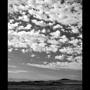
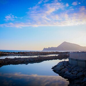
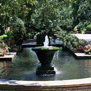
I'm trying to convince a buddy of mine to common over and join TPF. With his permission, I'm posting a few of his pics from his gallery for feedback ( all in seperate threads ). So folks... lets see some good feedback for my buddy. Its open season.. he's open to any type of comments good or bad. Hopefully, I've picked a few that are worth putting here for your comments.

IMG_0349.jpg
 
I think this one is pretty good. The perspective had me wondering for a while. What angle was it shot from? Is it tilted or not? stuff like that...

I think it's missing a strong focal point though. It needs one point that draws the viewer's eye. Maybe the taller tree in the centre could be a focal point but I'd like to see something more interesting to go with this spectacular background.
 
For what little it's worth I just like it!
 
Big Mike said:
I think it's missing a strong focal point though. It needs one point that draws the viewer's eye. Maybe the taller tree in the centre could be a focal point but I'd like to see something more interesting to go with this spectacular background.

I agree
 
Big Mike said:
I think it's missing a strong focal point though. It needs one point that draws the viewer's eye. Maybe the taller tree in the centre could be a focal point but I'd like to see something more interesting to go with this spectacular background.

I agree as well but otherwise it is a great crisp photo nice job.
 
This kind of scene is difficult because we want to show the beauty of the whole scene. The image is gorgeous

I would like to see an image of just the trees, cropped above the rocks so that one only the brush, trees and sky are included. Also crop just to the left of the twiggy branch to the right of the tall tree. This produces a greatly simplified image that has the tall, lighter tree standing out as the obvious subject. A little more contrast, deeper blue sky, would bring it out even more and dramatize the shadow areas. Cropped this way the convergence which is causing the confusing angles resulting from the uphill angle seems less obvious. ADDED LATER: I intended, but forgot, to say that it could also make a pretty dramatic B&W.

To my eye the image as is tries to include too much resulting in competition for our attention. This is exacerbated by the uphill angle which seems less obvious when the image area is reduced. It's trying to take shots like this that has me on the prowl for a perspective correcting setup. If you tried to eliminate the convergence problem by backing up and getting higher, the tall tree would get lost in the forest.
 
I really like this scene. It is clean and pristine. Excellent exposure. Good detail in the shadows as well as the high lights. But the crop pulls my eyes off the right margin.

I wonder how this would look on a library wall hung as a 40x50.
 

Most reactions

New Topics

Back
Top