Photo World

minicoop1985

Been spending a lot of time on here!
Joined
Sep 3, 2013
Messages
5,520
Reaction score
1,865
Location
Appleton, WI
Can others edit my Photos
Photos OK to edit
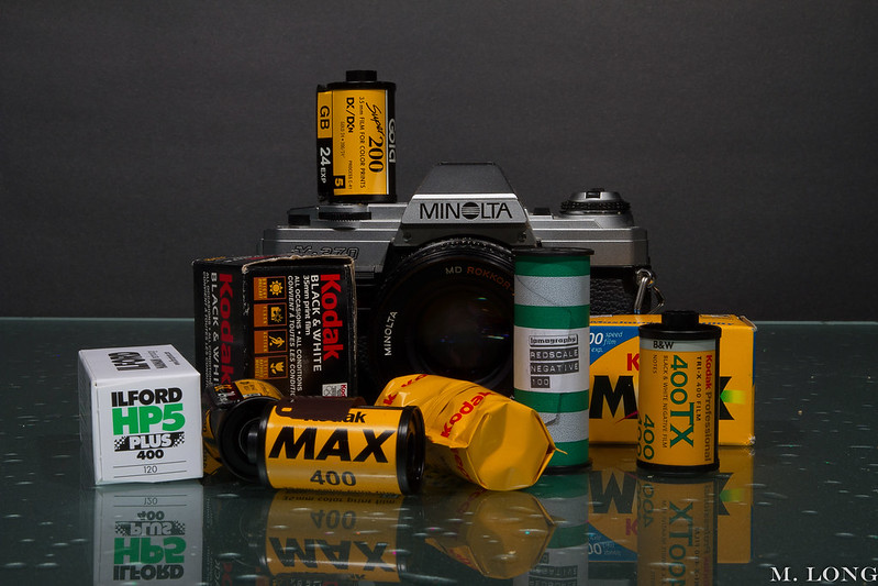
Photo World by longm1985, on Flickr

Shot I did for the local lab's Facebook page. Thoughts/feedback always appreciated. They wanted a pile of film and a camera, and, well, we all know I have both... :lol:

BTW, I think this is my first post in here. First time a client's OK with me posting the image (I ask what their wishes are and respect them).
 
Thanks, Matt. The best part is that they're happy. I try to make all my clients happy (maybe two haven't been), but these folks are particularly important.
 
Overall I like it. Thanks for sharing.

I have a few nitpicky comments, which I hope you'll take as constructive criticism.
-The image seems a tad underexposed to me (granted that I am on my day-job computer now). This is most obvious in the white Ilford box on the left. It seems like the brightest part of the image is your name, and I suspect that isn't even that bright a white.
-The "horizon" (table edge?) is tilted slightly clockwise. The camera seems well squared up, so I don't think it's just a tilt to the image. I might try burning that table edge line to reduce its prominence. Not that it's that bright now, and it is interrupted, but it is the one element which spans the image from left to right, so on some level we expect that to be, well, level.
-Overall I like the arrangement of your items. I like that you put the roll of film on the camera, it adds a nice splash of color to that part of the frame. It's probably just a trick of perspective, but it does look like this roll is a bit unstable, like it's leaning back. Perhaps if you had stacked some more boxes and rolls behind the camera you could have gotten the same vertical color (and added some more depth) while giving that top roll a seemingly more stable foundation. Or maybe not.
-And while we're talking about arrangement, perhaps the most eye-catching element is the Max 400 roll - it's almost centered horizontally and almost square to the camera, so you get a bold block of color, and the word "MAX" is the largest unobscured text element in the shot (and it specifically stands out from that block of color). That's all good. Unfortunately, the bit of film coming over the top and largely obscuring the word Kodak gives the feel that you are trying to obscure, or even censor, the name brand. Maybe this issue goes away with more exposure (so you get the color of the film differentiating itself from black), or maybe you need to trim the film back. The devil is in the details...

Like I said, nitpicky, and meant in the spirit of things to consider going forward.
 
That's some incredibly insightful advice, Rob. I very much appreciate that. You're right, it's a tad undercooked, and the film is leaning back a bit. These are things I'll try to keep in mind next time, as well as aiming the light just right to even things out in the back.
 

Most reactions

Back
Top