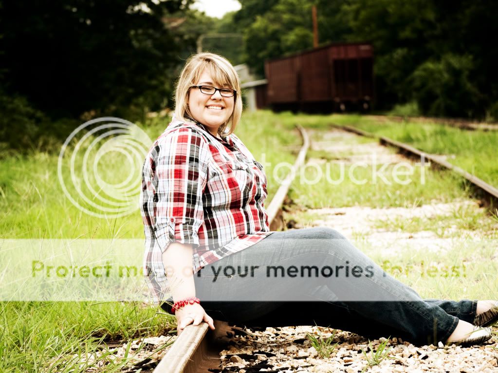
#1. Her feet are cut off. The frame could have been shifted right to include her feet and her body would have been on the left third and her legs would have followed the bottom third.
#2. Same picture, different crop.
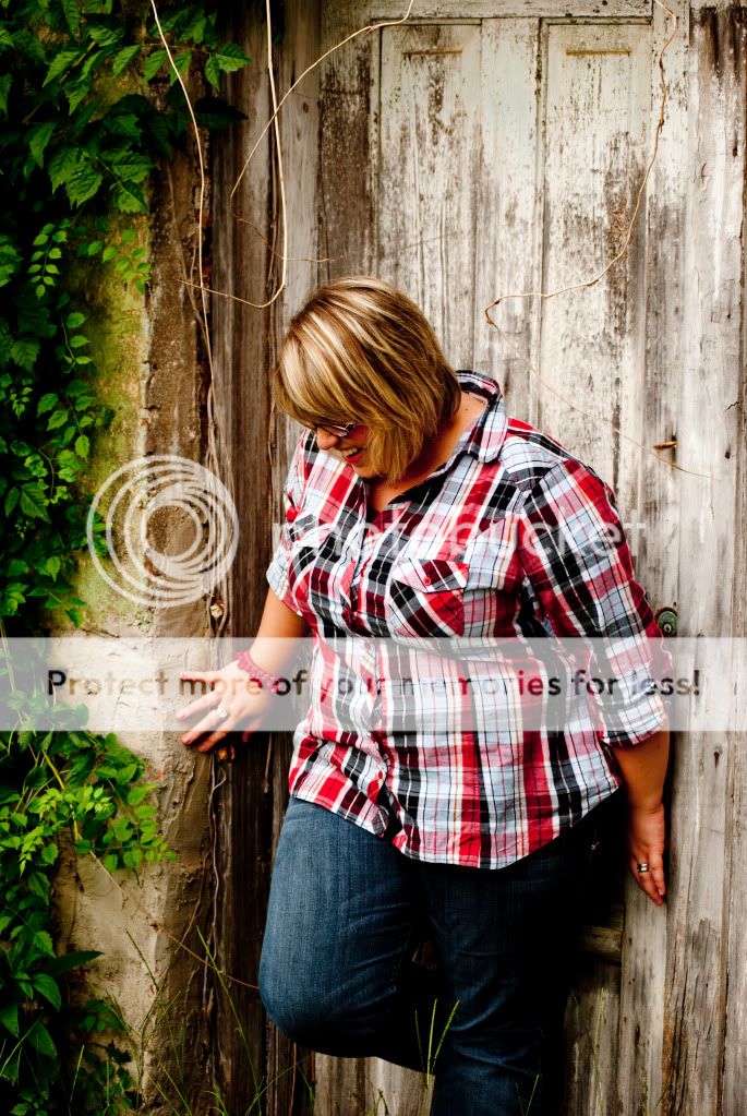
#3. I would have chose less space at the top of the door and included her entire body.
Ok here goes. All of them are good but I think when you are taking pictures of a heavier girl you have to be VERY careful of cutting her body off anywhere like in number 2 & 3 because you want her to be elongated and when you cut her off at the joint it definetly doesnt help as it puts emphasis on her middle. Number one would be great if her foot wasnt cut off and it seems a bit overexposed to me. I love the candidness of the last one. I like the colors/contrast in the third one but it seems a bit soft. Nice work keep shooting.
I'm quite taken in by her natural (and naturally big and beaming) smile in the last photo, "squinty" or not. I quite like that one. It shows how pretty she is!
With regards to the others (1 and 2 are the same), everything has been said: in 1 detail of her face gets lost in the (small) amount of overexposure and - ok, the thing about her foot has been mentioned often enough. It seems like you managed to bring the bit of detail back in 2, which in itself is good, but here comes what all others said before me about cutting off parts of her body by the framing.
#3 looks like you sharpened what was not quite as sharp as had been desired, and unfortunately it shows. Plus you have plenty of room above her head but cut through her calves ... she COULD easily have been inside your frame with her whole body. And I so expect her to NOW-NOW-NOW(!) look up and give us her beaming smile, and ... she doesn't .
The first one : kinda overexposed, with highlight clippings.
Second is like the first just closer, nothing new. but the exposure was better
Third :Nice but she was looking down.
Forth: Nice but it was too close. (perhaps portrait *vertical* would be better than landscape )

")


![[No title]](/data/xfmg/thumbnail/32/32160-4e45e524b050f1afae9fd21bf696d61b.jpg?1619735234)


![[No title]](/data/xfmg/thumbnail/42/42034-6262420ff3ea238f05395bbcc7ae1f28.jpg?1619739985)
![[No title]](/data/xfmg/thumbnail/32/32163-b5a5e5cde131a9d14df7f164ab9cb8ab.jpg?1619735234)
![[No title]](/data/xfmg/thumbnail/32/32162-dd2cfb373402c59de9c6f13cee73b0fb.jpg?1619735234)