Picnic Time

PNA

TPF Noob!
Joined
Mar 12, 2006
Messages
2,771
Reaction score
7
Location
Wave when you see me go by.....
Can others edit my Photos
Photos OK to edit
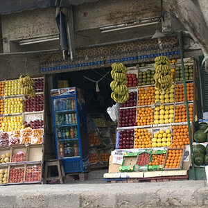
This a final shot....I promise not to retouch based on any critique.

Taken on a street corner in Athens back in the early 70's. I do not have any technical information to offer except I used a Nikon Ftn with a 55mm f/1.2 lens, manual focus (what's that you say).

I am looking for objective and subjective comments and please do not deviate from the issues at hand. Do not let the title dictate, It's something I needed to use to get it posted.

Also please overlook the dust particles, since this photo is scanned from a flatbed and is old.

Many thanks in advance.......:D

7985-BasketsTPF.jpg
 
to me least there is nothing really interesting in the shot, just seems to be a snapshot and thats all.
 
I rather enjoyed this as it complies nicely with the rules of this forum.
:thumbup:
 
Sorry...I´ll be right back (I´m gonna read the rules again to check what´s ok)

I want to say, it´s not too bad, but I have a few issues with it regarding composition and exposure...
 
Sorry...I´ll be right back (I´m gonna read the rules again to check what´s ok)

I want to say, it´s not too bad, but I have a few issues with it regarding composition and exposure...


Great....!!!

Please make sure you stay within the guidelines, thanks, I don't want any stamps.
 
yeah id say composition problem
 
I did not read any guidelines ... but still I will type something :p

First of all it shows part of everyday life in Athens around that time, hence to me it appears rather documentary and as such has a certain value.

As for the exposure, it seems slightly hazy in the lower part and a bit overexposed on the newspapers.

composition wise the framing is rather tight, on the left and right, where the subjects actually touch the frame. Apart from that to me it appears balanced, but also not to exciting (no tension) in the composition:
It pleases the eye, but does not leave a deep impression if you know what i mean.
 
Dear PNA.Thank you for posting this image here for critique. I immediately sensed that this image was worthy of considerate critique primarily due to its placement here, as well as the fact that it is a photo.

I´ve divided up my critique into three parts since I feel this is the most appropriate way to determine the values of the photograph and. since in critique, it is necessary to state and explain the 'strengths' and 'weaknesses' of a photograph. as I see it anyway.

Here goes with my best shot.


1)
objective - after careful viewing of this photograph, in my mind I have tried to separate and dissect the elements that make a successful photograph. and offer you the following few notes of individual areas of strengths and weaknesses I believe I have found. After this I´ll view the photograph as a whole and make notes about the effectiveness of the combination of elements.

center of interest - the three items: the two baskets and the bundle are clearly the main components here...

subject placement - no dispute that their rather classical central positioning, albeit slightly awry, is beneficial to the image as a whole. I don´t think any other placement would have added anything, but rather may have subtracted from the overall quality of this composition.

simplicity - also no fault stands out here. The three elements are one of the most fundamental forms of composition and their dominance here adds strength to the simplicity of this image.

viewpoint - I think this could be an example a possibly over-used, one could say, typically direct viewpoint. Not to say it doesn´t work...often the traditional viewpoints work very well for a multitude of reasons.
However an alternative angle could possibly have been found, at least investigated...for example, by moving a few yards to the left and shooting with a slightly longer lens, from a slightly lower viewpoint, thus grouping the items more tightly together, and making use of what appears to be a dark background there on the right of your image.

balance - looks fine, but see my comment about tone below...

shapes and lines - the roundness and fullness of the three objects is pleasing to the eye, and the rough symmetry keeps the attention well focused here. The slightly off-vertical corner of the wall helps lead the eye to a more or less natural center, although this is again an often over-used foil in picture constructions, it couldn´t easily have been avoided in the angle you chose. Again, moving to the left may have reduced its dominance, and allowed another contrasting diagonal to bring a little more balance in.

pattern - the repetition of the round forms here which are sufficiently similar yet different enough add to the interest. One is not overly conscious of this which I feel is an advantage to the subtle and erotic feel which I would like to address elsewhere.

volume - the spaces are quite well occupied, although I would have liked to have had a little more space above the three objects.

lighting - I feel the lighting could have been improved as mentioned above by changing the viewpoint to the left since the sliver of shadow on the right is slightly distracting...therefore it may have been better excluded, or, my preference, allowed to dominate the background.
However, I see another solution to this problem: it´s about the left and lower left areas of the print as it is presented here...and will be discussed shortly.

texture - excellent use of the grittiness of the wall, the ground and the baskets and bundle. The contrasts and juxtapositions are in harmony and indeed it is very difficult to go wrong here.

tone - This is not so easy to critique when viewing such a small image on a monitor. Overall there don´t appear to me to be any great problems here.

contrast - again, the monitor perhaps doesn´t do the image justice, but as I mentioned earlier, there is perhaps an issue here which I feel rather strongly about which may help produce a stronger image. The upper right of the image contains a noticeable black diagonal which is large enough to draw the eye away from what I see as the main elements of the image. Now, if you were to bring a form of balance in...something to counteract this, where would it be? The left side, and the lower left...precisely! You are lucky...this is something I think you may have overlooked in the darkroom...because the technique of burning-in these edges is relatively simple, and provided it is not overdone will be scarcely apparent while at the same time, will add the necessary weight. The result will be a more balanced image.

framing - as already mentioned, nicely classical, but in this case may have been improved by moving around to the left.

foreground - here too, a little darker by simply burning in is my suggestion for a subtle improvement.

background - the close cropping is nice, and therefore in this view there isn´t really anything further to say apart form the earlier comments about viewpoint and the upper right shadow.

perspective - the 55mm lens here proves its worth, by allowing this to be a natural image. By that I mean, the over-use of extreme wide angles today has become quite a cliché and a perspective that doesn´t "shout" is refreshing.


2)
interpretive Now I will attempt to interpret and summarize the meaning of the photograph based on my experience and interaction with it.

You were probably attracted at first by the simplicity of the forms. It is also possible the three round forms subconsciously alerted your eros...your sense of the erotic, and drew you closer. You circled it briefly but didn´t feel bold enough to investigate it too deeply...indeed, did you attempt to photograph it..."her", from another angle? You reacted to something aesthetic as well as primitive...this was an arrangement, and the three objects become complicit! You could not avoid taking this photo.

To me...I too would have been attracted to this constellation. The thoughts I have outlined are mine as well as possibly yours. This also may be the foundation of why I have chosen to offer my critique. It´s a "universal consciousness" that most of us are subject to.
The symbolism is clearly there upon analysis...the figure of the woman, yet the discarded objects also speak of loss, waste, and perhaps the transience of worth...death perhaps?


3) subjective - after viewing the photograph both objectively and interpretively, and becoming more acquainted and familiar with it. I must turn to the subjective, my personal evaluation...

This is not, in my view, a really outstanding photo, yet it has merit in that it (nearly) conforms with the classical elements that exist in many successful photos. If it was better printed it would be far stronger without becoming loud or disconcerting. It contains a poem which would require time to savor...and sometimes that´s what makes a great photograph.

There are several things I would like to know more about here, in order to finalize my comments, if that is indeed possible...
1) Is the image truely sharp?
2) What is the film type...therefore grain quality?

Yes? Then good sharp grain structure would be a plus, and by burning in the left and lower left edges, a print size of say 16 x 20 inches, well matted and with a simple black frame, would allow justice to be done to this relatively quiet, yet strong, poetic image.

One should not tire of viewing it easily.

D
(I need a beer now):thumbup:
 
OK....good points. Can't do anything about it since it's a "final".

wrong, you should not change THIS image, but you can still create a new final image from the material you started with, and post it in a different thread.
 
Yeah, but did you like it????...

Err, sorry...I´ll have to look at it again. That sort of assessment will take a bit longer however.

I just wanted to mention that I´ve been rather worried about my comments about your image...lying awake at night even: I made one or two suggestions for improvements. I´m not sure if I´m allowed to do that here. (although I like the way Alex put it)
 

Most reactions

Back
Top