Pics from last week

jocose

TPF Noob!
Joined
Sep 16, 2005
Messages
3,059
Reaction score
118
Location
dans la pissoir
Website
www.musingsofjocose.com
Can others edit my Photos
Photos NOT OK to edit
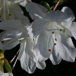
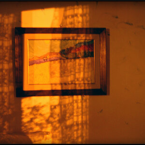
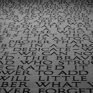
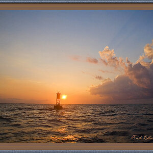
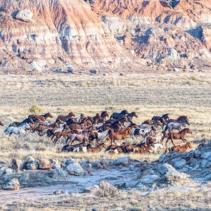
I really like some, and I am not too sure of others. I will leave it to you to decide which are which.

1.
DSC_4347.jpg

2.
DSC_4350.jpg

3.
DSC_4389.jpg

4.
DSC_4406.jpg

5.
DSC_4409.jpg

6.
DSC_4428.jpg

7.
DSC_4463.jpg
 
3, 5 and 6 for me. [We're obviously helping you narrow it down, aren't we??
rolleyes.gif
]
 
I really like 4 5 and 6 :)
 
Wow! Great stuff Mister JoCose! :) I'm lovin' #3!

#1 I think I'd like a bit more if the tree weren't directly in front of the house...if it were at an angle in which the tree was next to the house, it'd be more appealing to me. I do like the colors in that one a lot.
 
I think you might not like Photo 2 that much because of the blown-out bit in the background?
I still like that one, though! :greenpbl:

And do you maybe not like the white balance in the last, but do like the deformation of that sculpture by the wide-angle lens?

You cannot NOT have liked the sky you had for Photo 1!!!
No one can, I say.
A blue sky is something soooooooo rare these days!

How about Photo 6 ... would you have wished for the letters to go up instead of down? I do...

Or do you feel that maybe the nose of the horse should not have been so very centred?

C'mon, tell us!
 
Thanks again everyone.

Corry, yea, the more I look at it, the more I think you might be right. I was actually tempted to do it in PS, but then I decided to watch THE WAR AT HOME instead.

LaFoto, you are pretty accurate except the horse...I played around with cropping out the black empty space and some other stuff...but in the end I liked this one best. I do have a pic of the words going the other direction. I wasn't as happy with it as I was with this one (I think I focused on a different spot so it's not as sharp). I might go back and play with that one and post it as well...we'll see.

Thanks again.
 
Not crazy about the first one, but the rest are really nice! The water looks a bit overexposed in the 2nd image me thinks. I REALLY like the neon sign shot, very cool.
 
Thanks guys.

Mr. Matt...I actually don't think it's out of focus. If you look at the screens in the upper left corner that part is in focus (I think). It's the rest. I think I caught it as the images were changing...either way, I agree with your assessment....that was one of the ones that I am not too happy with :) Thanks for comment!
 

Most reactions

New Topics

Back
Top