Playing with frames and themes

Pennywise

TPF Noob!
Joined
Apr 5, 2007
Messages
58
Reaction score
0
Location
Boston, Ma
Website
www.ilovesleepers.com
Can others edit my Photos
Photos OK to edit
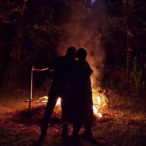
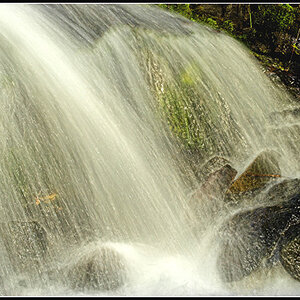
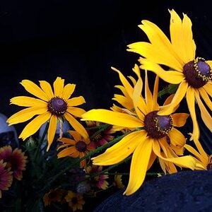
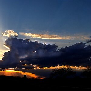
this is my first go at throwing 2 or more images together. The three are HDR taken at Grist Mill in Mass.

GristMill3imagesSmall.jpg
 
While each of the images looks like they might be very nice, the three of them together seem very discordant.

They are really hard to see at this size - barely 300 pixels high.
Why not repost three separate larger images; they are thematically related?
 
It is difficult to say anything 'critical' about these because I like each of them enough to feel almost disloyal to say anything. However here goes.

In reverse order because that is easiest. While all of these depend on texture for a good part of their impact, the third picture has the additional impact of piercing one of the sacred cows of photography, the Rule of Thirds. It is a collection of symmetrical pieces that come together very nicely.

The second and first are both lovely compositions, wonderful color but do have tiny flaws that probably irritate only me.

I am prejudiced against elongated portrait crops - I think that the second picture would have as much or more of an impact if it was cropped slightly top and bottom to a 4 x 6 format. (I don't think that the b/w frame is good on this)

The first picture is slightly hurt, IMO, by the clipping of the door lintel on the left.

I really like all of these; it is just these unfortunate little things that pop out at me.
 
I think you overdid the range on the waterfall and the red door. The shot of the whole mill is a good use of HDR-- it looks like it was shot on slide. Expanding the color gamut is one thing, but I think you pushed it a bit too far here.
 
I have to agree with Max. I think for a series like this, I'd like to see something a bit more cohesive. These 3 shots, while they are all from the same location, don't tie well together becuase of their radically different post processing. I think 3 black and whites would work better, or 3 with the same color processing (and maybe not quite as far)
 
I think if you bumbed the colors up more in the first photo to more closely match that in the third, the series would relate more. Then you could also play the colors of the outer images off the middle almost monotone image.

My referance is to the first posting of the images all togother in the frame work
 

Most reactions

New Topics

Back
Top