I'll probably not be very popular here and I'm a little embarrased to say that I think this is only the secont time I've commentated on one of your posts and both times to say what I don't like about them!:blushing:
Usually I like your shots & there are enough good replies that cover what I think.
I'm not too keen on this one though. I love the bright bit of the sky that looks very dramatic kinda like coming out of a storm but the crop/composition feels like there should be more under the flag poles? The gray, desaturated and darkened clouds seem to lack the excitement of the brighter sky and I don't know if you've added it but the vignetting seems to cramp the shot making it feel squashed in.
There are probably people far more qualified than me who have already replied and I know I mostly base my opinion on what I can see and maybe not on technical merit of which I'm still learning!:blushing: (But I have been wrong before and am still keen to learn new stuff)
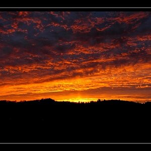
I like the mood to this Jon. The clouds really make this shot.
That was kinda the feeling I was trying to capture with the drama in the clouds when I shot my Golden Sky post.
NIce work Jon.
dude, im just diggin at ya. i agree with much of what you say.
i think my problem is working everything on my laptop. i get exposure/tones just where i like them and post. then later when i see it on Linda's desktop or here at work, they appear quite different. sometimes i let it go, others i change. im sure there are programs that help calibrate monitors, but im wondering if it's possible to get the same results between a desktop and laptop. either way, thanks for the critique Chris


")


![[No title]](/data/xfmg/thumbnail/34/34139-e52deba745f42ba091907fcc460cd6db.jpg?1619736311)
![[No title]](/data/xfmg/thumbnail/39/39193-6ebc8ca9478a68b5fe2120c2163f40d3.jpg?1619738908)
![[No title]](/data/xfmg/thumbnail/35/35224-c14babe4157e05767660f47e7de82aef.jpg?1619736959)
![[No title]](/data/xfmg/thumbnail/30/30879-16ad830465e571dee0a784c7fa122909.jpg?1619734493)
![[No title]](/data/xfmg/thumbnail/30/30876-d35f95603398bf3423b26c68d344f018.jpg?1619734492)
![[No title]](/data/xfmg/thumbnail/34/34140-74799834a513b0cbf28dfda9aeae291b.jpg?1619736312)