Exposure is fine on both images, but the composition seems a little lacking; nothing concrete I can put my finger on, I guess just a lack of something. I think #1 would have benefitted from a little more of the building to the left showing. As well the boardwalk tends to take the eye right across the bottom of the image and out, always try and use lines like this to lead to the middle of the image. #2 woud be helped by the removal of the rental sign in the middle of the image.
I'm entirely happy with the composition of the first shot. The dark weight and size of the leftmost buildings give good balance to the details, interest and colour of the right side of the shot - no problem there. The line of lighter upright posts is a good counterpoint to the flat masses and horizontal elements above. You have a well placed eyecatcher in the window with the red reflection, and a secondary one in the gull. The shot works quite well for me, though the flat sky lets it down a bit. But that's what you had. Some will say the pole that exits the top of the frame should go, but not me
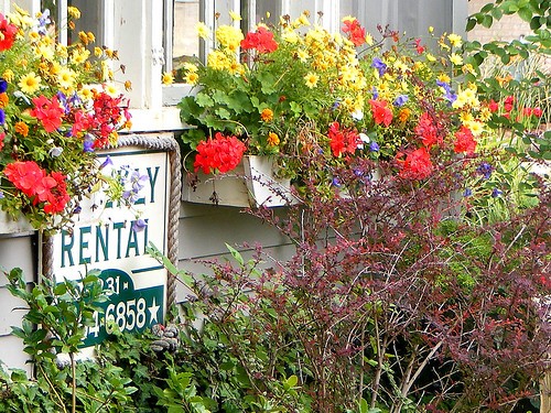
The second shot lacks organisation and focus for me - it's full of too much. One of the window boxes and some adjacent wall and window might have been enough.


")

![[No title]](/data/xfmg/thumbnail/31/31048-f39974e8ef7d33d3e635eed5b44e603b.jpg?1619734587)
![[No title]](/data/xfmg/thumbnail/37/37605-90c8efaef5b7d1f52d4bf8e7dfd33673.jpg?1619738148)
![[No title]](/data/xfmg/thumbnail/42/42016-4e3a2f053aa7a987a0b51e5a0fe85262.jpg?1619739978)
![[No title]](/data/xfmg/thumbnail/31/31046-f1d28c614676726741e90ce5b420a03e.jpg?1619734586)