please comment

kRiZ cPEc

TPF Noob!
Joined
Aug 20, 2006
Messages
65
Reaction score
0
Location
HK
Website
www.photoboxgallery.com
Can others edit my Photos
Photos OK to edit
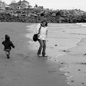
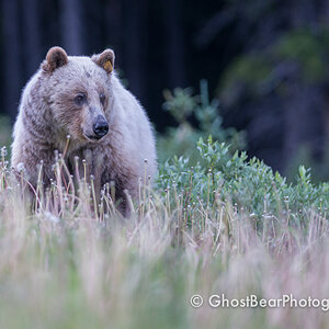
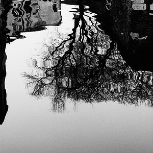
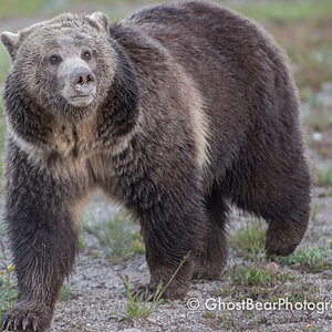
Went taking photo twice last week, selected some from the slot and post them here. Please give me some feedback, such as what you feel about them.
20003966.a1fdd3.jpg

001
20003972.aa84eb.jpg

002
20003981.0df74d.jpg

003
20004019.d76bc9.jpg

004
20004026.989f49.jpg

005
 
These are just so so IMO, except for the last one. In particular,

#1 needs something more to make it stand out. There is not really much there to look at, objects are too far away.

#2 is too dark, and again, objects are too far away to really notice any detail.

#3 is cool, but looks like you had some camera shake because of the low light. A fast lens would help on that, or crank up the ISO a bit more to compensate.

#4 is hazy and lacking contrast. The composition is pretty good, but the top of the mountain is cut off, and the foreground is not all that interesting.

#5 definitely stands out as the best one for sure! Great composition in that one, and good color.

All of them need to be posted as larger images, at least 600 pixels wide. Its very difficult to critique detail with this size of image.

NJ
 
If you add contrast and lighten two it becomes a better picture to use as an example of the creature since it is more detailed.

It looks as though number three needs more contrast.

The last on seems to be fine to me

The first one I didn't understand so I didn't try to analyze it. Hope this helps some.
 
These are just so so IMO, except for the last one. In particular,

#1 needs something more to make it stand out. There is not really much there to look at, objects are too far away.

#2 is too dark, and again, objects are too far away to really notice any detail.

#3 is cool, but looks like you had some camera shake because of the low light. A fast lens would help on that, or crank up the ISO a bit more to compensate.

#4 is hazy and lacking contrast. The composition is pretty good, but the top of the mountain is cut off, and the foreground is not all that interesting.

#5 definitely stands out as the best one for sure! Great composition in that one, and good color.

All of them need to be posted as larger images, at least 600 pixels wide. Its very difficult to critique detail with this size of image.

NJ

Thanks very much NJ. I have sharpen 003 a bit.
20050498.2dcb48.jpg

Does it look better now?
 
If you add contrast and lighten two it becomes a better picture to use as an example of the creature since it is more detailed.

It looks as though number three needs more contrast.

The last on seems to be fine to me

The first one I didn't understand so I didn't try to analyze it. Hope this helps some.

you certainly helped a lot! :wink:

Following your suggestion, I give 002 a tighter crop and did some contrast adjustment.

This is what I got:
20050640.8ea3a7.jpg
 
Just got a photo a butterfly ready:
20050245.300fec.jpg

I have cropped, and sharpened it. Please also comment on this one.

Finally I am no longer a newbie, moving up!
 
Yes, now you get initiated. Who's got the goat? Can of lard? Camera?
 

Most reactions

Back
Top