Please Critique My Photos

LiveStrong2009

TPF Noob!
Joined
Feb 2, 2010
Messages
170
Reaction score
0
Location
Milwaukee, Wi
Website
www.flickr.com
Can others edit my Photos
Photos OK to edit
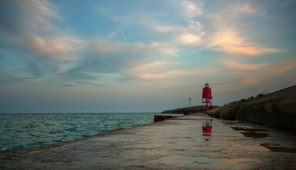
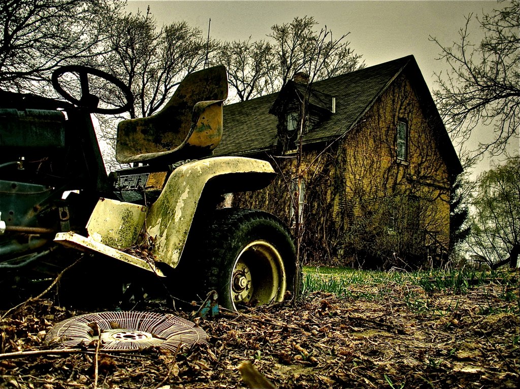
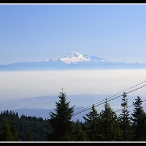
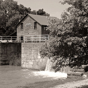
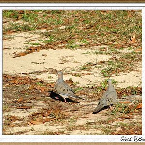
I am looking for any type of comments or critiques on how to make these better, or things to work on when taking future pictures.

1.
4488661040_bfb4c155a5_o.jpg


2.
4477819739_868b6ef506_b.jpg


3.
4488012323_40647035bb_o.jpg


4.
4491626843_3700e49ffe_o.jpg


5.
4490134787_20b6275c7b_o.jpg
 
I absolutly love the 4th and 5th images. Fantastic.
 
They all seem pretty dark, and try experimenting outside HDR.
 
1. I feel this one could use some contrast.
2. like this one.
3. doesnt do much for me, try b&w?
4. could be very nice with a little less hdr. just tone it down a bit.
5. really like this one.
 
I agree with above comments, But to me the skys in 1,3,5 let the pictures down, not so much of a problem in the last image, I think number 4 is a stunning image. Think you need to boost your levels for 1,2,3.
Hope that helps
Jonny.
 
Thanks for your comments and critiques everybody.

Generally I do shoot things that are not HDR, but I just learned how to do it, so I have been playing around with it a lot lately.

What did you change in that picture? I can see the difference and I like it a lot, but what setting did you change? Saturation and Saturation Highlights?
 
1. Doesnt do much for me. But I just dont like railroads. :)
2. I like it, but I'd also like to see more of the water since it's such a pretty color. I do like how you have it laid out here though too.
3. It's an interesting building, but its a little dark to me.
4. Well I'm a sucker for HDR clouds, so I like that. :) But the flowers look a little odd. Could you have perhaps done less HDR on them?
5. I like this one a lot. There's so much to look at!
 
Okay, so #4 just looks a bit too much like a painting rather than a photo.
When I have a little time later I will brighten up #3

Does anybody have suggestions for #5? That is the pic I am most proud of in this bunch of pics, if there is a way to make it better, that would be awesome. Also, do you find it distracting that the front of the lawnmower is cut off and it blocks part of the house?
 
The lawnmower does kindof distract me from the shot, not only being cut off, but like you said.. it is blocking the house. With the hdr/pp in this photo i think the house as a subject alone would look quite awesome

I also love number one.. however, the yellow thing down the track really kinda bugs me, and draws my eye away from the main subject.. maybe clone it out?
 
It really works for me even though a bit dark. I really like #2!

Love the shooting low.
 
Being a beginner, you can take what I say with a grain of salt, but on number one the trees behind the caboose seems to grow out of it and is somewhat distracting. I don't know if it could be shot from a different angle. I absolutely love the last shot even though I don't know what makes it so appealing to me. Maybe it is the textures.
 
#1 could use a bit more contrast. I love #2 and #5.
 

Most reactions

Back
Top