Please critique these for me......

coastietech

TPF Noob!
Joined
Mar 25, 2007
Messages
155
Reaction score
0
Location
Va, USA
Can others edit my Photos
Photos OK to edit
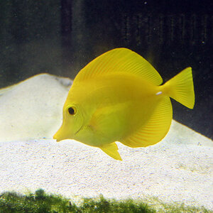
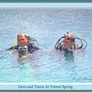
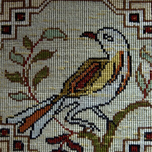
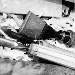
Just like the title says I would like to know what I did wrong in these photo's and what I did right. Please don't hold back. I am very new at photography and I want to get better. Thank you in advance for all your help.

1.
redandyellowroses4.jpg


2.
redandyellowroses5.jpg


3.
ButterflyWorld46.jpg


4.
ButterflyWorld41.jpg


5.
ButterflyWorld12.jpg


6.
ButterflyWorld01.jpg
 
Come on, nobody has any comments that can help me.
 
This is a non-pro photographers point of view... Heres my .02 --

# 2 boring... dont like it. LOVEEEEE the rest of them. I even like the color on # 2 just dont like the whole baby breathe thing.. 1,3,4,5,6 love the colors... The composition is kick ass... Sharp photos... Awesome job.

Someone on this forum said.. If you can recreate the same shot within 5 minutes,its an unoriginal shot... I thought that saying was pretty cool.. especially being VERY new.
 
I like them all, but same goes for me about #2. I like #2 the least. I think maybe a little more bounce flash or diffused light. The light looks a little too hard for me. The colors look great though on the rest.
 
what kind of bird is #3? i want one!
 
I absolutely love #3! The colors are seriously popping off that bird, perfect pose, and how detailed the wet feathers are. If more of the feathers were in more focus, it'd be insane.

#1 is a very close second, I like the droplets on it and how good the color is.
 
The first photo makes me wonder what your light source was?
I don't think it was a "white" photo light, for the photo looks quite yellow (so does Photo 2) and would actually require a reduction of yellow (i.e. in the levels for blue) highlights from 255 to 200, and maybe even a lowering of yellow midtones (also in the levels for blue) from 100 to 90. That would give the rose a more natural colour. All in all the photo could do with upping the highlights (rgb-levels) from 255 to 235.

Photo 2 has too harsh shadows, a not so pleasing composition, a cool all black background (!), and the same colour problems as Photo 1 does.

All the other photos are just perfect. What is there to critique about? Well chosen DOF, perfect focus --- composition gives the two birds A LOT OF headroom and pushes their eyes almost into the very centre of the photos, I might have tested out various croppings, but that is just me... - overall these are good!
 
Thank you all for your comments. The first two photos were taken under tungsten light so thats why it has the yellow/orange color to it. I think I may have up the saturation and added to the problem as well. The harsh shadows probably come from the built in flash that I popped for the photo. I still haven't learned how to keep the built in flash from being so harsh. The other photos were taken at a really cool place in FL called Butterfly World. Thank you again for taking the time to look and leave comments.
 
The 2 does not sound to me... I like the rest of them.... Great macro on butterfly
 
I love butterflies that's for sure, I like all of them except for the second one. Looks like weeds grew beside the flower. I'm loving the bird too soo lovely :D
 

Most reactions

Back
Top