
bobaab
TPF Noob!
- Joined
- Jul 28, 2005
- Messages
- 196
- Reaction score
- 0
- Location
- Park Ridge, IL/West Lafayette, IN
- Website
- bobaab.deviantart.com
Some shadows from a gate..I actually turned it upside down..I thought it looked better that way. What I'm most concerned about is the shadow in the top right of the picture. Is it too much?
I cropped this picture so I can change the picture a lot..but please tell me if you like or dislike how the picture looks now. Thanks!

I cropped this picture so I can change the picture a lot..but please tell me if you like or dislike how the picture looks now. Thanks!

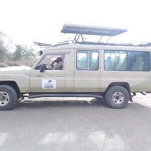
![[No title]](/data/xfmg/thumbnail/38/38734-a0c4ec46a440db881aca3700b0c62879.jpg?1619738703)


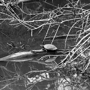
![[No title]](/data/xfmg/thumbnail/38/38736-5bc266b035e23faf5ad942bdd97466a8.jpg?1619738703)
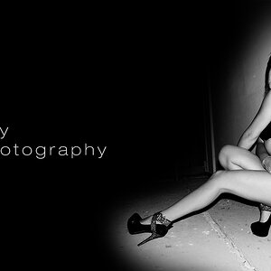
![[No title]](/data/xfmg/thumbnail/41/41781-7dcfd2ee71d4a453b4ad9fb5c7e723f1.jpg?1619739890)
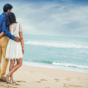
![[No title]](/data/xfmg/thumbnail/39/39511-592cbd68b1d797ffce7e41e4fbfed890.jpg?1619739066)