deepdesign
TPF Noob!
- Joined
- Mar 16, 2008
- Messages
- 20
- Reaction score
- 0
Let me know what you think. Any comments are welcome. thanks in advance
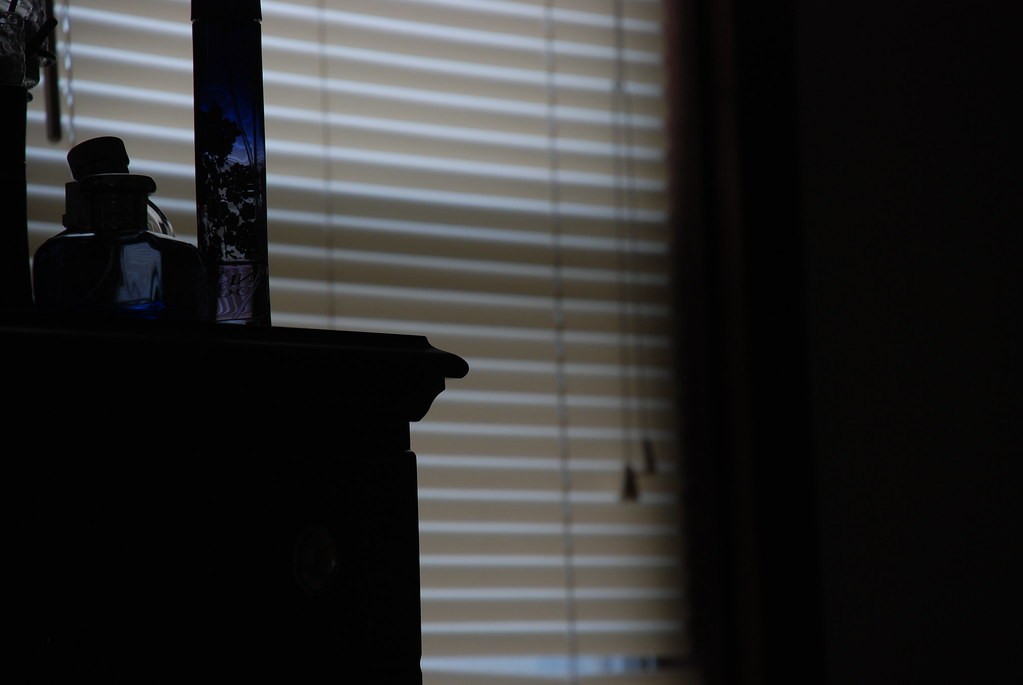
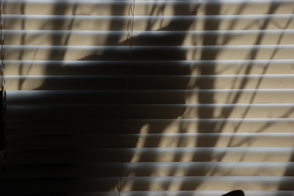
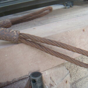
1.
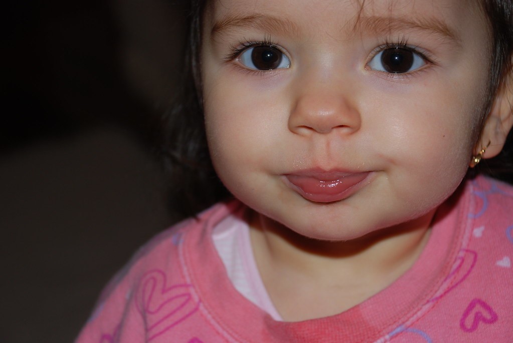
2.
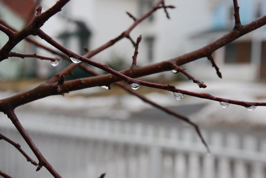
3.
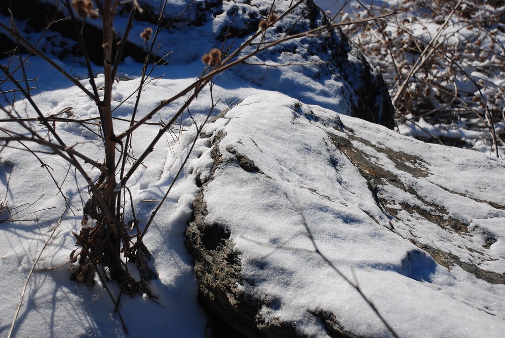
4.
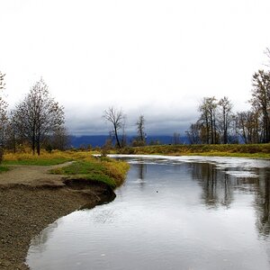
5.
6.
all pictures were taken in manual mode.
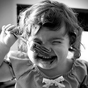
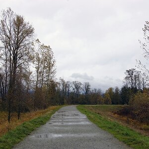
1.
2.
3.
4.
5.
6.
all pictures were taken in manual mode.


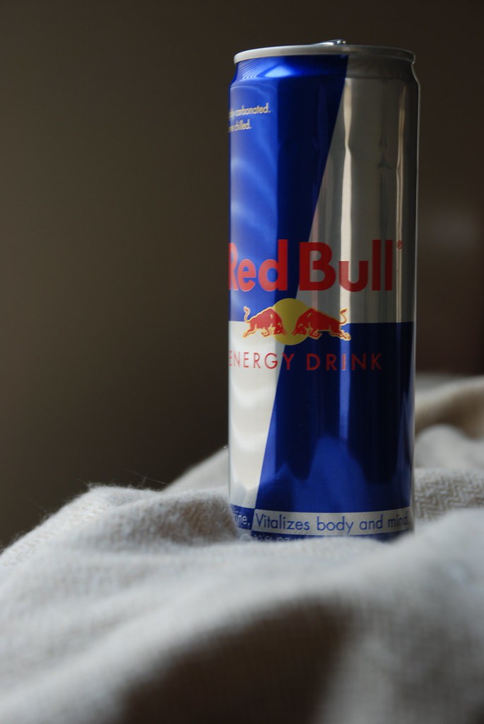
 ). Red Bull is an energy drink, yet you have it depicted in a very drab manner. Good lighting & focus, DOF not bad, and, yes, some of the bottom needs cropped.
![[No title]](/data/xfmg/thumbnail/36/36303-10b1a386a9a00cf90fb7605d2d2c48c1.jpg?1619737497)
![[No title]](/data/xfmg/thumbnail/34/34694-c8f837b622c45caaa51c5507b8835376.jpg?1619736605)