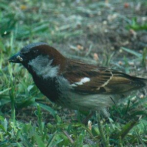
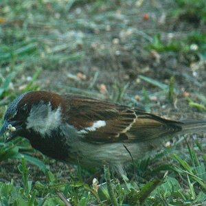
I agree...she's cut off top & bottom with room to spare on the sides.
The dark side of her face could be a little brighter (as could the whole image) and I'd like to see a catch light in her eyes. As they are, they look too dark and lifeless.
It also might help to give her a digital beauty treatment. A little blur to hide minor skin imperfections and so forth.
Thanks for the feedback so far. I agree that it would have made a better vertical shot but oh well. I probably could stitch her forehead and chin back on if I wanted to go the photoshop route
What drew me to this shot though was her eyes and expression as craig noticed. Too bad about the high sun and heavy shadows when I shot this.
Craig - the photoshop thing is a whole thread in itself. If I find the motivation later I will start one.
I have threatened to start a "Great photo, but ß? light" thread. I think it concerns our minds eye perception of what is acceptable. Meaning; we may inadvertly dismiss photos due to lack of shadow or highlight detail. Why? Another thread should be introduced; vertical crops are ß? because we view the world horizontal.
I have threatened to start a "Great photo, but ß? light" thread. I think it concerns our minds eye perception of what is acceptable. Meaning; we may inadvertly dismiss photos due to lack of shadow or highlight detail. Why? Another thread should be introduced; vertical crops are ß? because we view the world horizontal.
Well in my experience (albeit limited), especially with black and white I tend to have problems with shadow/highlight detail being to great. Often much greater than what I saw then and there. But I guess that is the same point eh?
Introduce the vertical crops are bad thread and I'll play on your team for sure
The idea is; the eye perceives something close to 20 times the info that digi or film can record. Grey or dark areas are tough, because we saw them as pure white not more than a moment ago. On the same token; you thought that you cropped grandma and grandpa tight to the the lilac bush. On film (or whatever) the crop was too wide. All of a sudden your passion for grandma and grandpa blew the shot, because you neglected to look at the edges of the viewfinder.
I think your shot transcends this theory. Personally I keep a couple pieces of foamcore in the car to bounce light onto my subjects during said difficult lighting situations.
I like this one. I don't think it really needs extra light. The shadows add to the artistic sense of the photo, in my opinion. The subject in a portrait doesn't always have to be beautiful and well-lit. It can reveal something about the subject if it is shady in certain places, like in this one. Maybe a little more contrast between light and dark (left and right of the photo mostly) would be nice, since the photo does seem quite a bit overall middle grey. Also more contrast would add to the shadowyness of the image in general. One more thing, too: it feels like the camera was up too close to the face when you took the picture, which distorts the face (especially the forehead) a bit. I read in a photography book that if you use a longer lens (or zoom in), and thus stand farther back from the subject, it becomes less distorted and more realistic-looking. Below is an example showing what I mean with a car. The images are showing an example for wide-angle lenses, but the same idea applies to comparisons between normal lenses as well I believe.
On the left is the car taken close up with a lens at 20mm. On the right is the car taken from farther away with a lens at 35mm. You can clearly see the difference in distortion.


")


![[No title]](/data/xfmg/thumbnail/37/37488-1946adf246ec6e047915c668d3dcff15.jpg?1619738111)

![[No title]](/data/xfmg/thumbnail/42/42025-fa343f816d0cedc45447aa0b300e301e.jpg?1619739982)