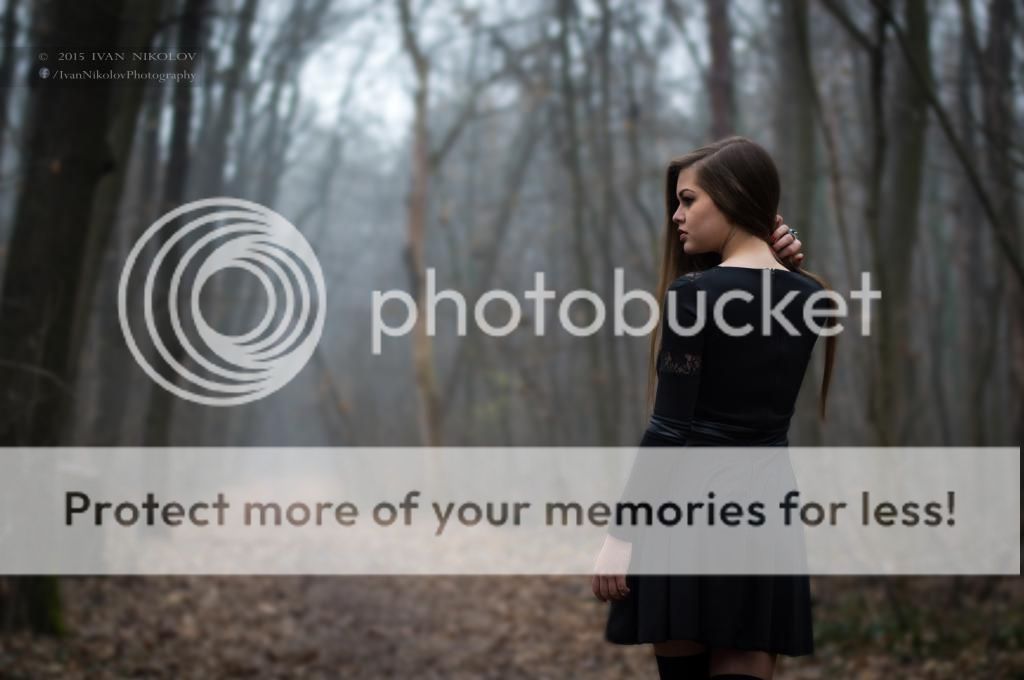
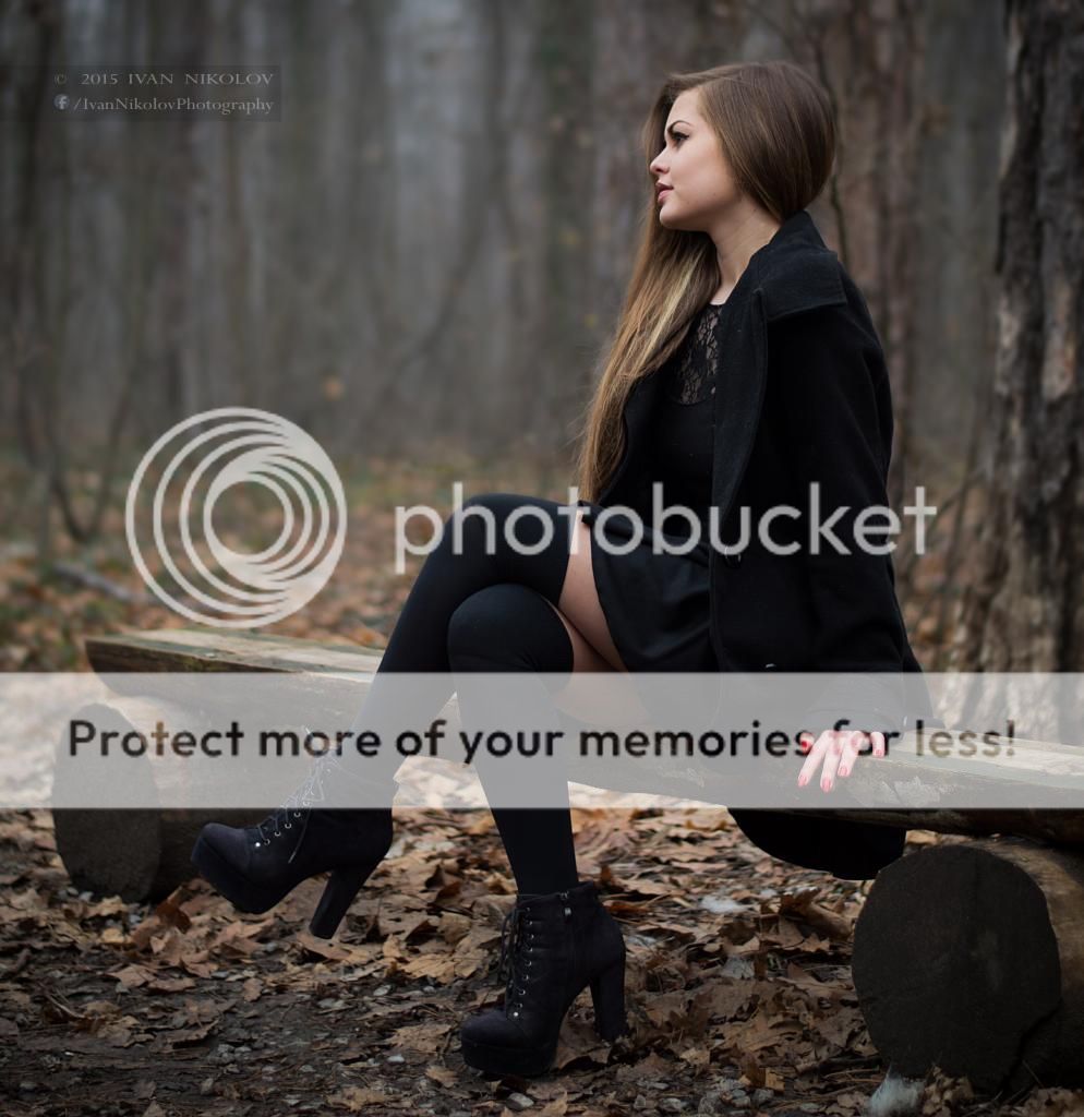
I agree you might need to take a look at the brightness/contrast in some of them. In a couple of them it would have helped to arrange the hair a little more to not have some strands or a hank of hair hanging in a rather awkward way (#1, 5&6).
I'd think about the framing, in at least a couple of them her foot/shoe is cut off, in one it's her fingertips (seems to be the bottom of the frame you need to watch, seems to be enough space above the head).
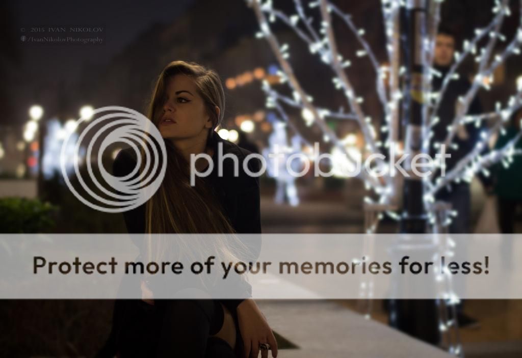
If you're out somewhere I'd keep an eye on backgrounds and passersby; with #7 it might have been better to wait til the guy standing there moved on; also the lightpost looks crooked, probably the perspective but do you want it in the picture or out of the frame?
edit - I think it's the details, I like the idea of the mood you're creating. I like the ones with the with lights, and those look better on your page than on here so maybe the quality of what we're looking at here isn't as good.
Like the ideas in all of them, the posing and such. To me the subject doesn't stand out from the background. Perhaps more light on her and less on the background. The dark clothes make it hard to make her stand out. Her hair may be the key - brighten that and her face up?
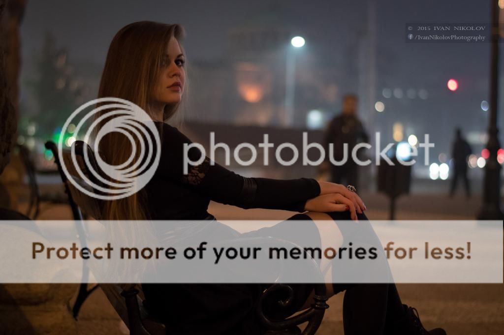
Looking at your album - if the lightness of the face and hair of #7 was on #15 (#6 Here) I think it would look better.
But, that's just my opinion.
I love the first three, they have some really nice colours in them, but wish that her feet weren't cropped out in the the third.
The rest have some compositional and clarity issues, but nonetheless show a good amount of thought has gone into these. The posing is mostly good and your locations work - I just think a little more care in placing your leading lines and exposing your model a bit better would have nailed them.
Practice is the only way to correct these, but it looks like you're on the right track! Keep it up!

") How can I improve or what to fix, next time?
How can I improve or what to fix, next time?


![[No title]](/data/xfmg/thumbnail/34/34346-f7996f51f0624620cfd54a488abeacf9.jpg?1619736382)
![[No title]](/data/xfmg/thumbnail/34/34344-0b42e0e92ad436e6710a1b9c4585d6df.jpg?1619736379)