portrait problems

The_Traveler

Completely Counter-dependent
Supporting Member
Joined
Dec 11, 2006
Messages
18,743
Reaction score
8,047
Location
Mid-Atlantic US
Website
www.lewlortonphoto.com
Can others edit my Photos
Photos NOT OK to edit
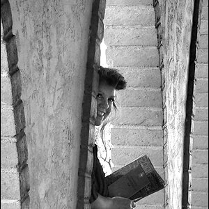
This was an impromptu shot taken in a mixed light environment (bulb overhead, fluorescent leaking in from left, late day window light in from right).
Because parents really want a copy of this un-posed portrait, I have been working on this to try to eliminate color casts.

I am past the point where I see anything with this one. (This is full-frame on D70 using 18-70 kit lens and sharp as a tack.)

I realize it looks a little warm but any cooler and other unpleasant color casts start showing.

C/C welcome.

12413-Ben20051225MBhouse_00103-Edit.jpg
 
Looks perfect on my screen. Like the quirky position of head versus background. Like that his hair is not 'perfect'. What's the little thing on his hand? Dirt?

The tone of it is really nice. Warm yet not too warm. It has a fresh feeling to it, too.
 
Try these numbers, I thought the colour looked better, but then again I don't really know the true tone of the boy. Curves>Red>input 214-output 200. Curves>Blue>input 153-output 160. I couldn't decide if the blue helped, but definitely the red curve did. Minor changes I know. I can post the edited version if you like, but since you have that rule in your sig thought I'd ask first.

One more thing, there seems to be a wierd colour on the palm of his hand. PS fill or something that got away from you? Also on the pattern on his left sleeve, and some wierd blurring on that sleeve too.
 
Looks perfect on my screen. Like the quirky position of head versus background. Like that his hair is not 'perfect'. What's the little thing on his hand? Dirt?

The tone of it is really nice. Warm yet not too warm. It has a fresh feeling to it, too.

Thanks, yes it is dirt.

Try these numbers, I thought the colour looked better, but then again I don't really know the true tone of the boy. Curves>Red>input 214-output 200. Curves>Blue>input 153-output 160. I couldn't decide if the blue helped, but definitely the red curve did. Minor changes I know. I can post the edited version if you like, but since you have that rule in your sig thought I'd ask first.

One more thing, there seems to be a wierd colour on the palm of his hand. PS fill or something that got away from you? Also on the pattern on his left sleeve, and some wierd blurring on that sleeve too.

Thanks
I will try the red correct in curves.
 
Sorry, I did post a badly edited version and I thank Romulax for letting me know in such a genteel way.
 
Well next time turn off the fluros. It's better to make someone orangy than green :)

It may be my monitor but ideally I think something between the top one and what mysteryscribe posted would be idea.
 
A bit green on my screen too. Agree w/ Garbz. The perfect balance is between your first post and your edit. Just warm it up a touch. Not much.
 
My monitor must be off the green on mine is the background the skin tone in the edit looks a little washed out maybe but not green. I might need to do a test print and reset my monitor.

I took a different look do you mean the shadow areas appear greenish?
 
Yes I think that's what they mean, the shadows. That's the exact result I got when I changed both the red and blue curves. Hence, why I didn't know if a blue curve adjustment was really necessary, I think a red curve alone got the skin tones right without turning the shadows slightly green (particularly behind the right cheek).
 
This is what started it all.
See the burnt out greenish tinge on the hand and his nose.
Well, I wanted to take that out and it all went downhill from there.
Untouched original
20051225mbhouse00101xb8.jpg
 

Most reactions

Back
Top