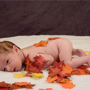
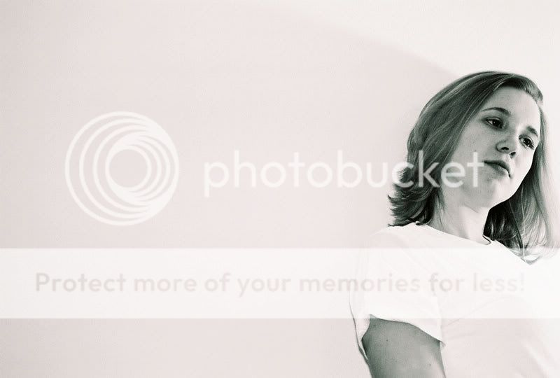
I think you have a tad to much empty space,and your light source might need a little taming. My eye keeps getting drawn to the bottom right because that area is quite bright.
However the mid tones on her face are a lovely shade! Good job there :thumbup:!
ditto the above plus:
this looks like a missed focus father than a fuzzy overall effect because her lips and nose look OOF while her left eye and hair look sharper.
the dark spot on her chin and in the middle of her right cheek are too obvious - they draw attention, need to tone them down a little.
OTOH, nice, comfortable pose
relaxed model with good posing skills
good composition and use of negative space.
a little more light control and other details and this is a winner.

![[No title]](/data/xfmg/thumbnail/36/36397-b2aca1c8ba1009853020154d6dd4b0e5.jpg?1619737550)
![[No title]](/data/xfmg/thumbnail/31/31011-439c1242fe08cf6b54f32bf06523a567.jpg?1619734567)