Hi there
I would say you need to work more on the exposure and composition in most of these, but they are a nice start.
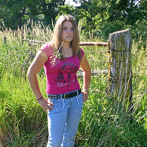
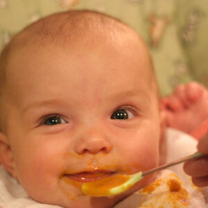
1) I find her very centered and straight on, Try moving her elsewhere in the frame.
2) Watch the face cropping. Although it is more accepted to crop the top of the head, you don't want to crop the chin.
3) This photo is very cool (blue) and I would put her more in the picture since she is the focus instead of so much deadspace above her. I think it may be a tad underexposed.
4) This one is underexposed and I would move him further up in the frame as well.
in #1, I find the messy hair to be entirely too distracting. Sometimes messy hair can work in a picture, if it's playful or fun, but for a straight on portrait, I feel like it really doesn't work.
The last one is a floating head, you want to avoid that. Cropping people above the shoulders usually looks awkward, unless it's a really tight shot. But with all the extra space in the frame it doesn't work.
First thing to do in PP is correct the white balance.
#1 - This type of shot tends to be tricky to get right. Her face is exposed well but the sky is blown out. Next time try to take the sky out of the picture by having the subject get lower or closer to the background (the trees). Try shooting people with the camera in the portrait orientation as well as landscape orientation. Nice backlighting on her hair.
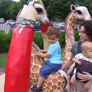
#2 - You filled the frame, which is good. Again, try shooting in portrait orientation. Nice DOF. The cut-off chin is bothersome. Would have liked to see him leaning his head in the other direction.
#3 - Too much trunk, not enough girl. Too centered. Exposure is good. Nice DOF. Might look better in the portrait orientation. Watch your backgrounds. Take the shot from the eye level of your subject.
#4 - This shot might have worked better if his eyes were 1/3 down from the top of the frame and he filled it a little more top to bottom. It's a little underexposed. Interesting stuff going on in the background, but the lines are drawing the eyes away from the subject towards the white block on the left. Portrait orientation and the subject filling the frame would have allowed the reflection in the glasses to be more noticeable.

")

![[No title]](/data/xfmg/thumbnail/42/42350-49b17d39599ec1d51c6d801ea651d3af.jpg?1619740148)
![[No title]](/data/xfmg/thumbnail/30/30995-7e48e5498fe9a56ea3d405cf87f3a1ec.jpg?1619734558)
![[No title]](/data/xfmg/thumbnail/40/40297-5b7d12c4c72c43b505a6f575d338d573.jpg?1619739411)