Post Bridal Pics Session

Status
Not open for further replies.

YoBenny

TPF Noob!
Joined
Aug 30, 2012
Messages
79
Reaction score
3
Location
Frisco Texas
Can others edit my Photos
Photos OK to edit
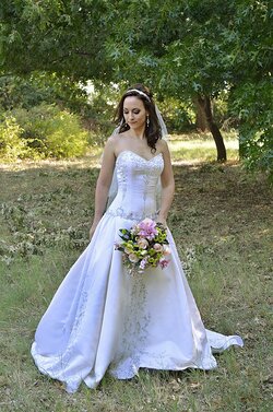
After everyone told me last week stay away from constant lights I gave it up and went to the real constant light, the sun, to take pics of this adorable girl.
I was a bit humbled by the event as I realized this is much harder than it looks. Anyway, she seems happy. Here are a few of them to be grimaced at and I appreciate the critiques no matter how harsh, I am trying to learn here.

http://www.thephotoforum.com/forum/...97t-post-bridal-pics-session-i-8nkzfww-x2.jpg

http://www.thephotoforum.com/forum/...99t-post-bridal-pics-session-i-h9gr2vc-x2.jpg

http://www.thephotoforum.com/forum/...01t-post-bridal-pics-session-i-j3gbs6b-x2.jpg

http://www.thephotoforum.com/forum/...902-post-bridal-pics-session-i-xjkgsb5-x2.jpg
 
Last edited by a moderator:
#1 the background is too close to the subject
#2 I like
#3 doesn't fit the motif well, it's a masculine pose in a feminine setting.
#4 best of the set. Her expression isn't quite bridal but it shows character.
 
Nice! You've lost a bit of detail in the dress in the first two -- if you have the raw files you might go try to pull a little more out of there (possibly even selectively, a careful and lightly handled composite of a detailed dress on the image you've already got can be pretty successful if you use a light touch).

The levels on her face in #3 seem a trifle high -- it feels lens-flarey slightly. There's a lot of blown stuff here, but whatever, it looks like bright sun which is was. The face looks slightly misty, though, I would darken it just a hair, and maybe push a wee bit more contrast in there, just locally on the face. A light touch so it all blends nicely, though.

If you cropped, and have the ability to re-crop:

I would move her slightly to the left in the frame in #2, to get a little more of the tree and avoid clipping off her dress, and to give her sight-line left-to-right a little more room to breathe.

I would move her face up and to the right, slightly, in the 4th one, to balance her face and the bouquet a little better in the frame.

These are, of course, quibbles and not major issues. Well done. She looks lovely.
 
Thanks for the replies and advice folks I appreciate you taking the time. Here is the kink in the road, I didn't take those, a professional took them.
16 years at it she said.
These are the photos I took standing beside her.
My better half likes mine better than the professionals, what do you folks think?
$c1.jpg$c2.jpg$c3.jpg$c4.jpg
 
Ooops, better change those to links, since you don't own 'em! Unless you have permission to post them?
 
Well we bought them so I guess they belong to me.
 
I think that tactic is of low character and if I was a moderator I would ban you immediately.
 
Aaaa, you foxed me. Now that I look at them, the fill is obvious, isn't it?

You did a much nicer job with the dress than the pro. The pro blew it out by overfilling, pretty consistently.

Your are much more natural looking, she's smiling instead of posing. I like your #4 better than anything else here. Yours have a bit of a blue cast from the shade, which I think you could fix easily - warming these up a tad would make them nicer all around. I miss the #1 pose from the first set though, which is wonderful. I love the background that close, it's a great contrast, and with the dress off to one side you get some nice visual tension.
 
and add to that that your images are NOT better, they lack the light that the originals had.
 
I prefer the first ones. Alot actually. The second set you posted have under exposed faces, and require fill light. While the dress has more detail in the second set, it also has a blueish tint. I also much prefer the smaller depth of field in the first set.
 
Ditching the blue tint helps enormously:
 

Attachments

  • $foo.jpg
    $foo.jpg
    317.2 KB · Views: 140
The first set are definitely doing a "thing", they're going for that sun-kissed warm thing, which definitely looks nice and cozy. You can warm yours way way up, if you like. They won't look sun-kissed, but they'll look cozy (and, I think, slightly weird, since shade is supposed to be cool).

The first set does stuff like lose the detail on the dress, which is very disappointing -- the dress matters.

I don't have much preference for whether faces are fill-flashed or not, I think yours look different but it's not as if her nose is invisible in the shadows. It's just a different look. Neither set has much modeling in it, yours has slightly more, I think, and there's more local contrast in the face making her look a little more dramatic. The fill-flashed look is "what all those other wedding photographs" look like, so it's expected and therefore people will tend to think it's better. I think it's just different.
 
Your edit Amoltor does nothing to improve this image. It's dull, flat and still too blue.


OP, you are no pro. Putting up another's images and not identifying them as such to begin with is in very poor taste. You have a lot to learn about photography and morality.
 
Sorry I offended some folks, I actually posted these that way because there seems to be so much animosity swirling around in these forums and I didn't want it to taint the opinions.
Thank you amolitor for behaving like a consummate professional.

Now please tell me how to get rid of the blue.

I agree that mine are a little under exposed, but I think that hers are way over exposed and it cant be fixed like mine can.
It also looks to me that she just has a plain old smudge on some part of her glass that cause a greyish area at the top left of her shots.
 
Status
Not open for further replies.

Most reactions

Back
Top