iBats
TPF Noob!
- Joined
- Nov 15, 2009
- Messages
- 460
- Reaction score
- 0
- Location
- philly
- Can others edit my Photos
- Photos OK to edit
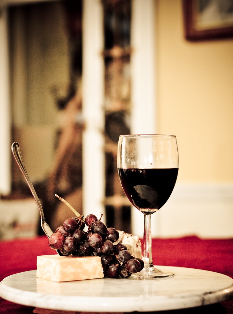
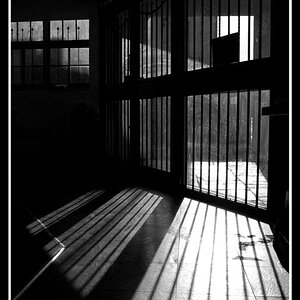
So all of these shots have the same lighting:
Overhead chandelier, and an SB-600 on camera tilt at 30 degrees, point top right

Convert to B&W
stack info: ISO: 400 f/4.0 Focal: 50mm Speed: 1/60
Like I said all of these have the same lighting

Did some frosting on the glass, it had a fingerprint and thats the best i could do to cover it up
stack info: ISO: 400 f/4.0 Focal: 50mm Speed: 1/60

No PP
Stack info: ISO: 400 f/2.8 Focal: 50mm Speed: 1/60
PP includes: Applying preset and screwing with it, which means i dramatizited the lighting desaturated the colors, and brought up the vibrancy
Stack info: ISO: 400 f/2.8 Focal: 50mm Speed: 1/60

PP includes: Putting a holga toy camera affect on the shot
Stack info: ISO: 400 f/2.8 Focal: 50mm Speed: 1/60
Overhead chandelier, and an SB-600 on camera tilt at 30 degrees, point top right
Convert to B&W
stack info: ISO: 400 f/4.0 Focal: 50mm Speed: 1/60
Like I said all of these have the same lighting
Did some frosting on the glass, it had a fingerprint and thats the best i could do to cover it up
stack info: ISO: 400 f/4.0 Focal: 50mm Speed: 1/60
No PP
Stack info: ISO: 400 f/2.8 Focal: 50mm Speed: 1/60
PP includes: Applying preset and screwing with it, which means i dramatizited the lighting desaturated the colors, and brought up the vibrancy
Stack info: ISO: 400 f/2.8 Focal: 50mm Speed: 1/60
PP includes: Putting a holga toy camera affect on the shot
Stack info: ISO: 400 f/2.8 Focal: 50mm Speed: 1/60
")


![[No title]](/data/xfmg/thumbnail/41/41779-303c41fcb3e37507cbe986d76dbfcf85.jpg?1619739890)
![[No title]](/data/xfmg/thumbnail/39/39469-3f2d242112dec8dc3e7b2836cc85afec.jpg?1619739042)