Processing...too much?

linpelk

TPF Noob!
Joined
Jan 1, 2009
Messages
406
Reaction score
0
Location
California
Can others edit my Photos
Photos OK to edit
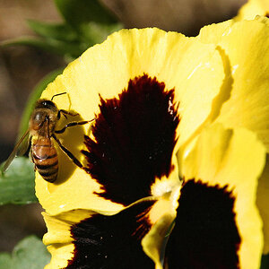
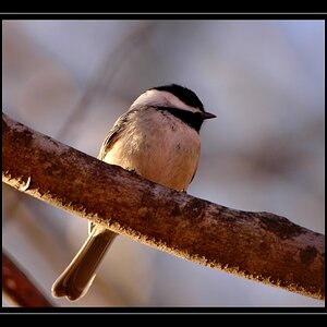
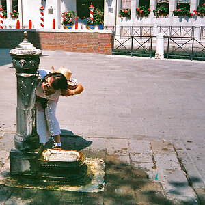
Here are a couple of pictures I took recently. Wondering if you think the post processing is a bit over the top. Actually any c & c is welcomed. Thanks so much!

I used one Speedlite shot through an umbrella at camera right.

IMG_7979.jpg
IMG_7979-1.jpg
IMG_7913.jpg
IMG_79131.jpg

IMG_7926.jpg
IMG_7926-1.jpg
 
Last edited:
I think your reds,especially on that cute little hat, are over-saturated or "blown out",especially on the third photo. In the first photo, I think you've over-saturated the blacks and the reds,and the flesh tones on both girls in the lower left and lower right hand corners, look awfully unnatural. I think if you print the first photo, the black parts of the girl's dress sleeve and the black hat will totally ink-up and look rather bad,along with the red hat,which will probably not translate too well to a printed image.

These are very "punchy" color-wise, but then I am old enough to have grown up on portraitures that was shot with VPS film which had a much more subtle palette and a lower inherent degree of contrast. A lot of younger photographers using digital would like the way you have processed these images, but for me, they look a bit too much like what is often deprecatingly referred to as "eye candy".
 
Great pics, i think the skin tones are alittle off though
 
I think your reds,especially on that cute little hat, are over-saturated or "blown out",especially on the third photo. In the first photo, I think you've over-saturated the blacks and the reds,and the flesh tones on both girls in the lower left and lower right hand corners, look awfully unnatural. I think if you print the first photo, the black parts of the girl's dress sleeve and the black hat will totally ink-up and look rather bad,along with the red hat,which will probably not translate too well to a printed image.

These are very "punchy" color-wise, but then I am old enough to have grown up on portraitures that was shot with VPS film which had a much more subtle palette and a lower inherent degree of contrast. A lot of younger photographers using digital would like the way you have processed these images, but for me, they look a bit too much like what is often deprecatingly referred to as "eye candy".

Thanks for your honesty. These pictures are of my daughters and I was really pushing the envelope on the post processing on purpose. I've never done this before because I think they make the pictures look unnatural, but they go over so well with people these days. I was just wondering what other photographers feel about it. It's nice to hear a seasoned photographer express their opinion.
 
Thanks MikeBookPro. I only got her to kiss her sister because I bribed her with marshmallows (which, by the way, are the perfect little motivator for kids. They don't leave a mess and they don't take long to chew) Thanks for the response.
 
Great pics, i think the skin tones are alittle off though

Any suggestions? Do they look too green? Too bright?

They look cyan blue. So they need to be warmed up a bit. Not too much because children that age have that porcelain skin. I think part of the problem is the blue wall. It almost looks like you have crossover. Do you have the original image before post processing?
 
Last edited:
Skin tone looks fine to me...

The PP looks good too - not over done to my eyes.

Eyes are soft in #1... (Actually, her whole face (both girls) looks a little out of focus...)

#2 is the winner for me.
(There's a tiny little white speck on her hat above her ear that I would clone out...)

#3 is great too, but damn, #2 still wins - lol!

:thumbup:
 
#1 looks like it just needs to be warmed up.

#2 and 3 look like crossover. I see both cyan and red in their skintone.

It could be from PP. Could you post the original image before PP?
 
I LOVE the high contrast/saturated look, however, I'm not sure if it works with these images. It's probably the background setting over the outfits, I associate the saturated look w/more tonal contrast, so with an edgier background (or solid). The red hat is almost blown, and hard to look at on my screen. I think you could back off a little on the saturation and you would love the photos. The first photo, even though it's softer, looks better because the red isn't overtaking the photo. Beautiful girls!!! You are going to have fun taking their picture as they grow!
 
Thanks everyone for your comments. I posted the originals SOOC and I think when I see them side by side that the skin tones DEFINITELY look better in the originals (and for SURE the red hat is too darn bright...easy fix though). It's the skin tones that I'm having a hard time maintaining. I think I'll start all over and see if I can fix it somehow. Thanks again.
 
...I still think that the processed ones are better (even the skin tones). The SOOC shots are too flat, and maybe slightly underexposed.

The ones you originally posted are much better.

The red hat-

In #2, I would not change anything. I would dial #3 down just a little to match #2.
 
hmmm...I like the post processing better however some of the tones are a bit off. When adding vibrance to colors my approach in the workflow is actually perform white balance referencing twice(especially with people). I perform the white balance edit in the beginning, then perform color management, then white balance in the end again. I do it at the end as well in order correct any deviation that may happen when editting colors. I don't know if that's SOP but it sure works for me.

Happy shooting :thumbup:
 

Most reactions

New Topics

Back
Top